Thursday, 30 June 2016

Welsh Tapestry Patterns for Home and Fashion Accessories


Anyone visiting Wales can hardly avoid noticing that there are a lot of sheep - about four sheep for every person living in Wales!

And where there are sheep, there's a woollen industry.

Today, most Welsh wool is used in the carpet industry but in earlier centuries, almost every cottage had a loom for weaving blankets and clothing, often in the traditional Welsh Tapestry patterns. And some of the original Welsh Woollen Mills survive today, some as museums, others as working mills using patterns found in the Public Records Office and dating back to the 1700s.

In earlier times, Welsh Tapestry blankets were given as wedding gifts and dowries and were kept as family heirlooms. More recently a Welsh Tapestry blanket was presented to President Obama when he visited Wales.

Everyone knows about Scottish tartans but Welsh Tapestry is less well-known, despite its long history and its 'revivals' at various times since the 1960s. Blankets and other textile gifts with these patterns, such as cushions and coats, are as likely to be found in Welsh Craft and Gift Shops as wooden 'Love Spoons' and Little Welsh Red Dragons.

But Welsh Tapestry blankets are expensive. Of course, they are not really 'tapestries' but a unique type of 'double-weave' cloth, sometimes known as double-cloth, and the weaving process involves, as the name implies, a complicated interlocking of two layers of cloth. So, while they are warm and hard-wearing as well as attractive, they are not cheap to produce.

As someone who lives in Wales and who is also addicted to pattern-making - and especially drawn to those with some kind of traditional or ethnic origin - it was only a matter of time before I turned my attention to Welsh Tapestry patterns. 


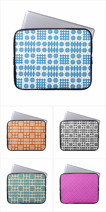
And I have chosen a few of them to use as patterns on non-textile gifts, such as coffee mugs and serving trays as well as cases and sleeves to protect your electronic devices!


Here are some of them -
Click on the image below to see the full collection - 


Click on the image below to see the full collection - 

Click on the image below to see the full collection - 


Click on the image below to see the full collection - 


Click on the image below to see the full collection - 

Welsh Tapestry Sleeves
Welsh Tapestry Sleeves  


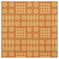
Fabrics in 'faux' Welsh Tapestry, in seven types, suitable for anything from crafts and dressmaking to home furnishings are also available in my 

Here are just a few of them -

And if you'd like a 'Welsh Tapestry' fabric or gift in a different colour combination, just contact me through my Posh'n'Painterly Cymru store
 and I will quickly create it for you at no extra cost. 


PS If you are interested in learning more about Welsh Tapestry, 
a website to get you started -


Thursday, 2 June 2016

Traditional Islamic Patterns in a Modern Setting


We don't necessarily need to know anything about Islamic Art and Design to gaze in wonderment at the patterned walls and screens of the Alhambra, the Blue Mosque, or the typically tiled floors and walls of Morocco! 

Feast your eyes on them here!


You will probably have noticed that the patterns are all based on a geometric grid and some of these grids can be extremely complex.

If you read my last month's blog post about William Morris, you may remember that many of his contemporaries also created abstract patterns based on grids. But William Morris took that one step further, using a geometric grid to provide the structure on which to build his floral patterns.

Islamic pattern design does make use of some floral motifs and motifs taken from Nature but it generally depicts them in a much more formalised way.

And whereas you would expect to see images of saints and holy figures in many Christian churches, this is highly unlikely in a Muslim mosque. There are differences of opinion amongst Islamic scholars about whether depicting human beings in art and design is idolatrous and therefore contrary to the teachings of Islam, and you can read about them in detail HERE.

But the beautiful patterns that decorate Muslim places of worship are no less related to the religious doctrines of Islam than the statues and paintings in a Christian cathedral.


For instance, the geometric shape we call a 'circle' is linked to the concept of 'Infinity', which in itself is a property of Allah. This article on the BBC website goes into these fascinating connections in more detail than I have time for here. 

And in the Islamic cultural traditions, crafts and decorative arts are regarded as being of equal status to painting and sculpture. So it's not surprising that these have been developed to such an awe-inspiring degree!


(On the left is one of my original screenprints, from the 1980s, of a very complex Islamic pattern.)


While I love to create flowing, painterly floral patterns and mini-prints that are often based on the flowers and other plants - even weeds! - in my garden, I am also drawn to the apparent simplicity of geometric grids. 


I stress that the word 'simplicity' must be qualified by 'apparent' because many of the traditional Islamic 'mosaic' patterns, while appearing straightforward, are in fact based on a complex system of geometric grids, placed on top of one another to create a harmonious whole.

The patterns are often constructed by overlaying circles, squares, rectangles and other geometric shapes and I find it fascinating that just these few 'building blocks' can result in such a variety of different patterns! On the right is an example from David Wade's book (see below) and I'm sure you can find his explanation of how the grid pattern was built up, if you visit his website.


I first learnt a bit about Islamic Art when I was designing patterns for cushions in a screen-printing class nearly thirty years ago. Coming from a background of landscape painting, almost always using a rectangular canvas, I was finding it hard to adapt to designing on a square. So my teacher lent me a very helpful book by David Wade - "Pattern in Islamic Art".

I've recently discovered his wonderful website which you can explore HERE

You'll find inspiring slide-shows to enjoy as well as detailed drawings, diagrams and analyses to learn from if you are so inclined! 

As we approach the Holy Month of Ramadan that culminates in the celebration of Eid-al-Fitr in early July, I think it's appropriate to show some of the Greeting Cards, Gift Bag and Wrapping Paper that I've created using, in many cases, Islamic Patterns:

Click on the image below to see the full collection -

And here are some really chic and girly Fashion Accessories, based on a geometric Islamic pattern -

Click on the image below to see the full collection -

With Father's Day approaching fast, here are some classy 'Gifts for Men' with an Islamic Geometric Pattern outlined in gold-effect on a black background:

Click on the image below to see the full collection -


But it's partly the use of rich colour in Islamic Patterns that draws the eye. So I've used some modern colour combinations to create some very chic Bathroom Accessories -

Click on the image below to see the full collection -


Here are some device cases - iPhone 6 cases are shown but other Case-Mate cases are available in the drop-down menu under 'Device Type' -

Click on the image below to see the full collection -

And finally, a collection of chic and modern Beachwear with traditional Islamic patterns that all coordinate so that you can mix'n'match the accessories to your heart's content -

Click on the image below to see the full collection -


I hope you've enjoyed this brief look into the traditions of Pattern in Islamic Art and the ways in which we can draw inspiration from the geometric pattern grids that it's based on to create beautiful Greeting Cards and modern Home and Fashion Accessories for everyone.


Thursday, 5 May 2016

Learning about Surface Pattern Design from William Morris?


William Morris


William Morris was not only the 'leading light' of the Arts and Craft movement, that sought to promote a return to handicrafts, as opposed to machine-made goods, in the late 19th Century. 


He was probably one of the greatest surface pattern designers (amongst other things!) of all time! And those of us who make patterns for home furnishings and wallpaper can learn a lot from the study of his work!

William Morris is probably best known for his wallpaper and household fabric designs. But he was skilled in many crafts, such as weaving, embroidery and stained glass. 

You can read a full account of his life and accomplishments -

HERE and HERE


Unlike Laura Ashley, William Morris was a skilled draughtsman, as you can see from these detailed working drawings for his 'Bluebell' design. 

William Morris working drawings


Also, unlike Laura Ashley, Morris's pattern designs were intended for use in the home, rather than for fashion textiles.

But there is a similarity! Like Laura Ashley's, William Morris's design theories were firmly rooted in his beliefs and attitudes to life. 

He was horrified by the poor quality and design of the products of mass industrialisation. And his ardently socialist views led him to want to make 'art' for everyone, not just for those born into wealth, like himself.

"I do not want art for a few, any more than education for a few, or freedom for a few." William Morris.

This earlier blog post, by the way, explains a large part of the reason that I still like to create Greeting Cards! 

Morris had some very strong views about design and because he wrote about his views as well as giving lectures, it's not too difficult to gain some insights into his guiding principles and the way he worked. 

I'm sure that most of us, hearing or reading the words, 'William Morris' will immediately think of his floral patterns for wallpapers and curtains, many of which are still available and popular today. 

In the 1970s I decorated a bay-windowed bedroom in our Victorian house in Sevenoaks with William Morris wallpaper and matching curtains, available at that time from Sandersons. The room was not as big as I would have liked and the matching curtains and walls made it appear quite a bit larger.


Then, in the late 1980s, our Edwardian Norwich home had William Morris wallpaper in the hall, stairs, landing and cloakroom - by this time, bought from habitat, as far as I remember! 


And a different Morris pattern for the curtains of a small and cosy living room. Wisely, the new owners of the house asked to keep the curtains when we moved out! 

But I took the beautiful Laura Ashley lace curtains (on the left) with me and finally had to replace them with something much inferior a couple of years ago because, having provided nearly 25 years good service, they were about to fall to pieces!

Now I just have a couple of cushions and a tablecloth with William Morris designs that have been re-coloured at a later date - and a set of Garden Hand Tools from the V & A! (Far too pretty to use!)


What these all have in common is that they are floral patterns. 
I don't think I've ever seen a William Morris design that isn't about flowers or fruit! I think it's very strange that we tend to shy away from using floral patterns or designs for men, as I pointed out in an earlier blog post - HERE! 

William Morris loved Nature and saw it as the antidote to the effects of industrialisation. 


I have an old book about William Morris, written by Ray Watkinson in the 1960s and it contains some Morris quotes about Nature, such as:

"The fields are all butter-cuppy. The elms are mostly green up to their tops; the hawthorn not out, but the crabs beautiful, and also that white-beam (I think they call it) with the umbelliferous flowers. In the garden we have lots of tulips out looking beautiful; the white bluebells and some blue ones; some of the anemones are in blossom and they all soon will be; they are very lovely. Apple blossom for the most part only in bud, but that cherry tree near that arbour opposite my window is a mass of bloom. The heartseases are beautiful; a few of the Iceland poppies are out; the raspberries are showing for blossom." William Morris

I think he must have written this at about this time of year, early May!

Interestingly, the author of my book, describes William Morris's intentions when it comes to his home furnishings in a way that certainly resonates with me.

"Although for him repose is an essential quality which the designer should pursue, this does not mean that designs should be blank and static; rather that they should give us something of the relaxed pleasure of a garden. A wallpaper should be able to turn a room into a bower, a refuge, without insisting on its presence in a room with us." Ray Watkinon

Later, the American architect/designer, Frank Lloyd Wright, also believed it was important for our well-being to 'bring nature inside', though his methods were very different. Here's another blog post I came across about the therapeutic properties of 'bringing the outside in'!

And I can wholeheartedly agree with this. You may have noticed that when in doubt, I design florals for the home!

But at the same time, William Morris didn't believe in letting Nature run riot in his designs. 

Another passage from my book:

"Entirely at one with his contemporaries in his recognition of the part played by geometric order, Morris required a design to play on the imagination for him, therefore there must always be some image." Ray Watkinson

So - Morris's patterns are representations of Nature but they are also based on some kind of geometric grid or structure, and I think it is largely this which has made his surface patterns so successful and timeless. Here, in this pattern, named 'Lodden', you can clearly see the traditional 'ogee-shaped' grid on which the pattern is constructed.

Lodden by William Morris

Nature, Geometry and one more 'ingredient' is ever-present in William Morris designs - Depth.

Arbutus by William Morris


"Wallpapers, he says in his lecture on Pattern Designing, must operate within a little depth. There must be a slight illusion - not as to the forms of the motif, but as to relative depth. And quite consistently we find in his patterns that one element is developed and spread like a net over another, with differences of scale and weight as to parts, so that we are always aware of a major pattern playing over a minor one." Ray Watkinson.


Daisy by William Morris


This third point is something that Morris developed over time but even in his earliest known wallpaper design, Daisy, he did not leave the background plain but added texture that immediately gives depth.

It looks to me as if he was influenced by his work in textiles - weaving and embroidery - but that's just my theory.


So there we have three important points to bear in mind when designing for home furnishing fabrics and wallpapers:

  • Bring Nature inside in a way that is restful to the eye.

  • Organise your patterns on a geometric grid.

  • Add depth by overlaying your main pattern on a secondary pattern.


I wish I had been taught these things on the Surface Pattern course I did three years ago, instead of having to do my own research more recently. 

Not that I would have wanted to try to imitate William Morris, of course! But these are three worthwhile principles to bear in mind when designing patterns for the home, even though we are bound to interpret them to fit our own style. Quite by chance, I think my 'Morning Glory' pattern has incorporated these three 'rules' to some extent, at least in the main pattern, which is based on an 'ogee' layout. 

Here are the fabrics I've designed for the collection, each of them coordinating with the main pattern, as you can see from the Faux Patchwork!


You can find more Morning Glory fabrics here:


The Morning Glory is the September Birth Month flower. 
So you might like to make someone's September birthday that little bit extra-special by choosing a greeting card or gift with Morning Glories!

Click on the image below to see the full collection -


I very much hope that any pattern designers reading this will have learnt something helpful. 

But I'm sure that anyone, designer or not, will have found something to interest them in this brief look at some of the theories behind the pattern designs of one of world's greatest surface pattern designers!


Thursday, 21 April 2016

Laura Ashley and Pretty Floral Home Accessories


I've just finished reading 'A Life by Design', a biography of Laura Ashley, written soon after her tragic fall, from which she never regained consciousness, at the age of 60. 


I read the book when it was first published in 1990 but at that time, I read it from the point of view of a Laura Ashley Home Furnishings customer, having used gallons of Laura Ashley Navy paint in the refurbishment of my Edwardian home in Norwich. I even painted the outside of the re-sprayed, genuine ball-and-claw-footed bath that we found in an outhouse when we bought the house. 

And here's the 'Laura Ashley Navy' front door of my next (Victorian) home!


But this time around, I read it as a designer, more specifically a surface pattern designer with a strong interest in designing textiles for fashion and home furnishings.

And it was as if I was reading it for the first time. So many things jumped out at me that hadn't really interested me back in 1990.

First and foremost, I was quite shocked to read that Laura Ashley wasn't exactly a designer! Neither she nor her husband, Bernard, could draw and of course, they started their business well before the days of computers!

The legendary little 'sweater scarves', table mats and tea-towels that they printed on the kitchen table of their Pimlico flat in the 1950s, ('fixing' the colour by baking in the oven, where some fell down and burnt!), these small items had bold geometric shapes a patterns, which was all that their rather primitive printing equipment could cope with.


But they sold well, because Audrey Hepburn had popularised the 'sweater scarf' in the popular film, 'Roman Holiday'.


However, Laura was already intensely interested in tiny floral printed and striped fabrics. She had worked as a secretary at the National Federation of Women's Institutes and when she visited one of their handicraft exhibitions at the Victoria & Albert museum, she realised that women were capable of working at home to produce textiles that were of museum standard. She was particularly struck by the patchwork and scoured the shops to find suitable fabrics so that she could make her own while awaiting the birth of her first child.

As we moved through the 1960s, fashion trends changed dramatically. Out went the full skirts with hooped petticoats and in came the mini-skirt and sharply cut dresses and coats with geometric patterns. In case that was before your time, you can get a flavour of the era HERE 

And it was in 1968 that Laura Ashley - or rather, Bernard, her husband, opened their first dress shop, selling dresses that were almost shockingly different! Bernard oversaw the printing, dealt with the marketing and business side of things - so, given that she was not a designer, in the usual sense of the word, what part did Laura play?

Well, she did supervise the making up of the garments in Wales and researched patterns to use, spending a great deal of time in libraries and museums, pouring over antique pattern books and so on. 

But Laura's essential contribution to what was becoming a successful business venture, was her 'unique idea'!


Coming from a Welsh non-conformist background, Laura Ashley had her 'puritanical' side. But she was also a romantic, she loved the countryside and nature and she was more drawn to the fashions of bye-gone ages than to the current trends. She may have had some rather naive ideas about how a working farmer's wife would have dressed in days of yore, but her dresses were based on earlier styles and the fabric patterns were, at least to begin with, mainly historical.


She firmly believed that women were more interested in dressing to look beautiful than in following the latest fashions. And she also took the view that the more you cover up - long skirts, long sleeves etc - the more alluring you will be! 

Put those two beliefs together and you have the classic Laura Ashley dress of the late-Sixties and Seventies. 

'Pretty but Prim' would be how I would describe those early dresses that turned the Laura Ashley brand into household name. 

I remember my first visit to a Laura Ashley dress shop, when I was staying with my sister-in-law in Oxford - to me it was heaven on earth! In fact I never bought a Laura Ashley dress because I loved dressmaking and made my own in similar styles. But I do still have a full-length Laura Ashley nightdress, complete with pin tucks, tiny, concealed, pearl buttons, and lace-trimmed high collar and long sleeves. It's somewhat the worse for wear now but somehow I don't want to turn it into a cleaning cloth so it stays at the bottom of my drawer!


Looking back, it seems strange now that the only fashion choices at that time were limited to 'bold geometric' or 'romantic with frills'! Today's fashion trends are far more eclectic so that you could almost believe that 'anything goes'. 

But even so, I think those two main, sharply contrasting, trends are still around.

Alongside the 'funky', 'quirky', sometimes bordering on 'outrageous' fashions, you only need to delve into Pinterest or visit an online store such as Etsy to see that nostalgic, romantic and downright 'pretty' is still as popular as ever.


Of the two design strands, the nostalgic, vintage 'look' is easier to live with in the long-term. Eventually, in the 1980s, Laura Ashley branched out into Home Furnishings. I'm only surprised she left it so long. 

I used Laura Ashley Brick Red wallpaper on the staircase, above the dado rail, in my Victorian home in Hereford. 

And the colour was the perfect backdrop for the pictures I hung on that wall. 


I also still use a Laura Ashley tea-cosy! Like all of her products, the quality is head and shoulders above most others.


Sadly, I've never found a good replacement for my Laura Ashley heavy cotton lace curtains, that looked fabulous, hung over slimline, navy blue Venetian Blinds, in three different homes, from 1987 - 2013, when they finally started to fall apart, as you can see by the hole down near the hem!


Bright, bold and minimalist is exciting, but perhaps more suitable for clothing than for home furnishings, which we expect to last somewhat longer than a dress, bought and worn today, possibly discarded a few months later! That is not to say that the more 'modern' style doesn't look great in an office building or a city apartment.

But for a home, especially a period home, the vintage, 'shabby chic' is much more comfortable to live with, day in day out, for a number of years.

I'm far from suggesting that we decorate and furnish our homes as faithful replicas of times gone by. But our surroundings do affect our mood and some of the more outlandish patterns currently available seem to have an almost 'aggressive' feel to them. Whereas a few 'pretty things' can soften the edges of our daily existence.

So here are a couple of my Home Furnishings Collections - not exactly 'Laura Ashley' but also based on floral designs and patterns -


100+ Floral Coffee Mugs - some ready to personalize:

Click on the image below to see the full Coffee Mug collection -


100+ Floral Pillows or Cushions - arranged by colour:

Click on the image below to see the full Pillow collection -

And just by the way, a floral mug or throw pillow or cushion, would make a wonderful Mother's Day gift or a birthday present for your mother!