Saturday, 30 January 2010

Romance alive and kicking in 12th Century Bavaria!

Christmas doesn't seem all that long ago and yet the shops have already well and truly moved on to the next excuse to separate us from our cash. It's not just cards - there's everything you need to properly celebrate St Valentine's Day, from overpriced, over-packaged confectionery to naughty knickers!

Whatever would St Valentine make of it all? Though, to be more accurate, I should have said, what would the many Christian martyrs who shared that name, think of the way we celebrate their feast day in the twenty first century? In fact the link between the various St Valentines and the February 14th 'holiday' is lost in the mists of time, if it ever existed at all, so they probably wouldn't have a view on it at all.

It's more likely that the idea of a special day for celebrating romantic love stemmed from the Middle Ages, and that Chaucer happened to mention someone called 'Valentine' in that context. Chaucer was writing towards the end of the Middle Ages, a time when the tradition of 'courtly love' and chivalry was at its height, especially among the poets of that time.

The picture above belongs to a collection of poems about courtly love, by mediaeval Bavarian, Austrian and Swiss poets, known as the 'Minnesang, which simply means 'love song'. Wouldn't it make a classy Valentine's card! Or how about this one? or this one?

I still think the one above is the best of all - a treasured postcard I bought when I was au-pairing in Germany in between leaving school and going to universtity (where I promptly gave up French to go into more depth with German, mostly mediaeval - probably for no better reason than that I was so entranced by the colourful paintings of the period!)

Little has survived of the music to which these poems were set but here is one of the poems -

Dû bist mîn, ich bin dîn:
des solt dû gewis sîn.
dû bist beslozzen
in mînem herzen:
verlorn ist das slüzzelin:

dû muost immer drinne sîn.


and its English translation -

You are mine, I am thine;
Of that you can be sure.
You are locked up
In my heart;
Lost is the little key:
You must be in there forever.

Wouldn't that be a touching 'verse' for a Valentine's card - not at all sure who has the copyright though! I rather doubt whether our modern-day equivalents will still be around 1,000 years later but in the meantime, we do our best!

A selection of handpainted Valentine's cards is available from my Greeting Card Universe Store and you can use the on-site search box to see the collection of Valentine's gifts I have created for my Zazzle store, many of which can be seen in the flash panel at the bottom of this page.

Thursday, 28 January 2010

Feeling silly!


I realised when my first cheque from Greeting Card Universe arrived today that I've managed to be very silly - all by myself!

I should have chosen the Paypal option for my payment but I couldn't remember my Paypal login details at the time so I opted to be paid by cheque; it never occurred to me that the cheque would be in dollars and I'd lose a whole lot of my meagre earnings in bank charges!

Ah well, I'll just have to put that one down to experience - and meanwhile you can see the products I've made from today's collage on Zazzle

Wednesday, 27 January 2010

Guest artist, Judith Cheng, writes about what inspires her paintings


Illustration was a good starting point for me.

I get to learn to juggle different styles and subjects. Whether I'm spending time in Paris or working out from my artist retreat, deep in the mountain, my environment offers me endless inspiration in terms of light, shapes, color and moods.


Keeping a sketchbook is my therapy and my best friend. I started my artist retreat blog two summers ago, which reflect mostly my time in the Catskill Mt., New York.


I just started another blog, about Tuxedo Park.

As an artist, one is forever open to new inspiration. Tuxedo Park, NY, is quite a unique community with lots of history and paintable views.


Yes, lots more inspirations to fill my sketchbook.

Hopefully time enough to work up to more finished paintings. My finished paintings will be on my website.

Judith's handpainted greeting cards are available at Greeting Card Universe.

Tuesday, 26 January 2010

Karen Margulis's Pastel Paintings

It seems I was mistaken when I wrote that painting snow was a challenge that few artists would rise to! Without intentionally searching out 'snow paintings' they seem to keep presenting themselves to me and I think these pastel paintings by Karen Margulis are simply stunning!

You will need to scroll right down to find the frozen creeks but there are poppies and all sorts of amazing paintings to enjoy on the way!

Monday, 25 January 2010

Another Lovely Snow Painting

I've just happened upon another lovely snow painting - Greeting Card Universe artist, Judith Cheng's 'Winter Glow' .

Judith offers more than 130 handpainted, mostly floral, greeting cards for sale at her Painted Cottage store on Greeting Card Universe.

I am delighted that Judith has agreed to write about her artwork on my blog, later in the week.

Saturday, 23 January 2010

Steps for Positioning the Elements of a Collage Design -

The slightly tricky bit about making a collage design like the one above is knowing how to position all your pieces correctly in relation to one another. Of course the problem doesn't arise if you are creating a purely 'decide-as-you-go-along' collage. But sometimes it is necessary to work out in advance exactly where each element of your design is to go, particularly when working with lettering.

The design above may look as if I just stuck on the letters wherever I fancied. But, although I wanted to give my card an informal, spontaneous look, with the letters 'bouncing' up and down on the 'line', in fact it was all carefully planned. You don't want to get to the last letter and find that it doesn't fit within the bounds of your page!

So here are my step-by-step instructions for making quite sure that everything stays in its allotted position within my design -

1.
  • First, make a cardboard frame with a 'window' that reveals the space you have to work within - here it is 10.5" x 7.5" because the finished card will need to be 7" x 5".
  • Then place a sheet of tracing paper over a drawing or print-out of the design - in this case, the word 'Daniel' using a rather fun font called 'Grumble' at its largest fontsize.
  • Next place the 'frame' in position on top of the design and the tracing paper. (You will have 3 layers - underneath will be the design, on top of that the tracing paper, and on top of both, the cardboard frame).

  • Once the three layers are in a position you are happy with, use a pencil to trace carefully round the 'design' and the inside of the frame.

2.
  • You will now have a tracing of the whole design and the parameters of the area available to work with.
  • So next you can move on to cutting out your collage pieces. Choose the collage paper you want to use for the first letter - I used papers that I had previously painted with acrylics but you may want to use attractive pieces of giftwrap or even coloured pieces from magazine pages!
  • Lay the tracing over the collage paper and carefully cut around the shape of the letter, making sure you cut through both the tracing and the collage paper. A craft-knife will probably do a better job than scissors as that way you can keep the tracing firmly in position.
(Sometimes, depending on the paper, it's easier to see what you are doing when you're cutting, if you work on the back (plain) side of the paper, but if you do this, be sure to turn your tracing paper over so that you don't end up with a 'backwards' letter!)

3.

You will now have your first collage letter cut out and ready to stick to your backing card. And it's here that the question is, how do you make sure that you stick it in precisely the right place?

My easy method is to -
  • First, use the frame to mark out the boundaries of your working area on the backing card you will use for your collage.
  • Then lay the tracing paper over the backing card, making sure that the outlines of the working area on both layers (the card and the tracing) are accurately lined up.
  • Next very lightly indicate in pencil where the first letter will be placed, using the hole in your tracing paper as your guide.Make sure that your pencil lines will come underneath the coloured paper that you are going to stick on the back card so that they won't show.
  • Stick down your first letter, using your pencilled guidelines to get the position right.
(If you are using tissue paper, your guidelines will need to be very light indeed! Or alternatively, you can mark out the position of the letter with glue on a cotton bud and stick down the letter while the tracing is still in position.)

4.
  • With the first letter now stuck in its correct position, repeat the same procedure for each letter, using the tracing to mark out the relative positions of the letters each time. This way you can hardly go wrong!


With the addition of a more or less random sprinkling of stars (or flowers, perhaps, for a girls' card), your card is now ready to scan and have the 'Happy Birthday' added on the computer.

Through much trial and error, I've found this to be the easiest, most fail-safe way to make sure that all the elements of my design are in the correct position - particularly important if your design contains people or animals!

The bonus is that with a simple design like a 'name' card, you will be left with a tracing paper template, that you might like to use again for another project!

'Here's one I made earlier!'

You can, of course, use a different colour for your backing paper. Black gave a very vibrant effect and I considered using black backing card. But to save myself time and work, I decided to use white card for all my name cards and to use my photo-editing programme to make different coloured backgrounds.

Of course, it would probably have been much quicker and easier to have created the whole thing on the computer, using 'layers'! But, apart from the fact that I have yet to completely understand how to use 'layers', I do think there is an elusive 'something' about hand-made collage that is absent from completely computer-generated work - maybe I'm biased?

You can see my 'name' designs made into birthday cards, as well as a selection of birthday cards I've designed in different styles, in my Zazzle store. Many have matching mugs and other gifts to go with them!

Friday, 22 January 2010

Hav u Cn R 1daful Selectn of T-shrits?

Almost as soon as I joined Greeting Card Universe, I realised that getting sales is not just a question of creating great products - marketing one's stores effectively is equally important. It doesn't matter how beautiful, original, cute, whimsical your designs are if nobody gets to see them! And I recommended in my first post that reading the forums is probably the best way find tips and help with this.

I've gradually come to realise how important one's 'key words' are for bringing customers to your door as a result of their searches. Choosing the right key words seems to be almost an art in itself! But yesterday I was amazed to read a response to a forum plea for help in attracting more sales. The response, from a seasoned online seller, not only emphasised the importance of key words, it actually suggested using words with spelling mistakes!!! The thinking behind this was that a lot of people can't spell so will type misspelt words and typos into search engines so you hook them that way!

I'm a spelling teacher when I'm 'wearing my other hat' so it goes against the grain a little to make deliberate spelling mistakes; but the other suggestion, to use texting language, might be worth thinking about if the market you're targeting is likely to be of a texting age group.

If none of this appeals to you, highly successful Dutch artist/illustrator, Corrie Kuipers has created a particularly clear and useful Squidoo Lens on how to get more sales at Greeting Card Universe that could be applied to all online selling. And not once does she mention bad spelling!

And, just by the way, here's my 'Selectn of T-shrits' on Zazzle - you can judge for yourself whether they are 1daful!

Thursday, 21 January 2010

More Paper Painting!

I couldn't put it off any longer, that list of phonecalls to make and 'contact customer support' pages to find for various odds and ends that aren't functioning quite properly about the house! The list was beginning to glare at me reproachfully so I set about it and spent most this morning being 'redirected' or 'on hold' - you know the sort of thing? What should, in theory, be a two-minute job always seems to eat up nearer an hour by the time you've been asked for your postcode, date of birth and all sorts of other total irrelevances, not to mention the 'How are you today, Mrs Adamson?' for the tenth time when you really want to say, 'I'd feel a whole lot better if we could just get on with it....!'

Eventually, having succeeded in sorting out all but one of my niggling problems, I felt I'd earned a little time with my paintbrush and paper before lunch. I enjoyed making the collage birthday cards for two of my grandsons who will shortly be reaching the age where it's so difficult to find a suitable birthday card for them - ie double figures! But after all those bold colours, I wanted a change to something rather more flowery and feminine for a girls' birthday card. So I went back to using tissue paper - coloured this time - and had fun using up some of the dried up gouache in my palettes.

Again, my hope was that those palettes would be much easier to clean by the time I'd scrubbed the paint with a big bristle brush until I'd produced the colour I wanted to paint the tissue. (You may have noticed that I don't like cleaning palettes - it seems such a chore after using pastels for a long time!) I've found that it's very important to get the consistency of the paint just right when painting tissue paper - not so thick that it drags on the paper and weighs it down. But on the other hand, it can't be so watery that the paper disintegrates - you'll soon discover what works best through trial and error. And, by the way, watered down poster or powder paints are also suitable as long as you find the right consistency.

A little white gouache (or poster colour) works well where your thin wash of colour might well not show up at all on the darker colour of tissue. I find a 'dabbing' movement with the brush gives me an informal, natural look for flower petals, butterflies and so on - again, don't 'dab' at the paper too vigorously. Tissue paper becomes quite fragile when it's wet and could easily tear. (But if it does tear, don't worry too much; you can probably avoid the tears when you come to the cutting out as long as you are using smallish pieces.)

With the 'Happy Birthday' again added in paint.net (which is SO like Photoshop - but free!), because I'm rubbish at lettering, this is how it turned out -
In my first attempts at collage, one of the things I pondered over, long and hard, was how to know exactly where to position my pieces. Google threw up a webpage with a long and convoluted method, involving a great many stages and marking lines - more than that I can't tell you, because it was so complicated that it lost me about a third of the way through the process. So I've worked out a very simple method using tracing paper, loosely based on the way Eric Carle works. And next time, I'll be taking you through the stages of that method, step by step.

Welcome Back!

The problem with the 'followers' panel seems to be repaired now. Welcome back - and thanks to 'blogger' for taking speedy action!

Wednesday, 20 January 2010

Followers in hiding!

I'm sorry, there seems to be a bug in the system and my 'followers' panel isn't working. Hoping blogger will fix it soon. In the meantime, please do feel free to leave comments!

Playing with Paint

Judging by the state of the cars coming into town this morning, there must have been heavy snow in the mountains overnight. Down here in Abergavenny, nestling cosily between Sugarloaf, Skirrid and The Blorenge, wet white stuff is falling from the sky in large enough amounts to make going for my weekly constitutional with the walking group seem less attractive than spending the morning in my attic painting collage papers!

I chose a selection of tissues papers that I had already painted with acrylics in slightly ‘fauvist’ colours and then proceeded to decorate them with dots and squiggles and wavy lines – the sort of thing a rising five-year-old might enjoy at Infant School, or should that be in their ‘Early Years Setting’, since nowadays, giving something a new label seems to be a common way to give the impression that progress is being made!


I’ve just made a useful discovery! Using a scrunched up tissue with the leftover acrylic paint in my palette produces a kind of ‘marbled’ effect on collage papers – and the bonus is that it helps to avoid some of the palette cleaning at the end of the painting session! That has to be a good!


As time goes on and I make more collage designs, I’m beginning to develop a preference for working with tissue paper that has been painted with acrylics. The paper need not cost you anything; gifts often come wrapped in white tissue and you can iron it if necessary, though, on the whole the painting will smooth it out. I recently bought a single sheet of glassine paper, costing 12p, from a local shop to protect one of my pastel paintings that was going on a journey. Imagine how my eyes lit up when the shopkeeper wrapped my momentous purchase in four full-size sheets of tissue paper, as well as the bubble-wrap!

And I’m doing my bit for ‘recycling’ at the same time!


More on how to use painted papers to make a card like this one later in the week....

Meanwhile, here’s a direct link to one of Geree’s ‘stores. (Sun and Surf Shop). And here is the link to her Tropical Hot Chili Peppers.


Monday, 18 January 2010

To warm you up after all that snow, guest artist, Geree McDermott, has contributed this post -

I am an American abstract artist, living and creating in South America. Originally from California, by way of New Mexico, I now live in a beach resort town on the central coast of Chile. My husband and bought a beach house with a splendid view of the South Pacific. So, I suppose it is no surprise that the beach, ocean, sun and sunsets emerge constantly in my drawings.

I draw everything by hand. That is the joy of creating for me. But what motivates me to draw in the first place is COLOR! You may have noticed that I like to use bright, vibrant colors with intense contrast. I only use Prismacolor pencils because they produce the vibrant hues I want to achieve.


I start with a 5 x 7 inch space and with a regular No 2 pencil. I draw a simple line drawing. I just let my hand draw without too much thought. Neither do I spend a lot of time planning the composition nor the color palette of the artwork. I just let my hand move as it likes. I am often astonished when I finish a drawing and step back to see what design and colors emerged.

Interesting things surface this way.


My drawings are available as functional art on a great many great gift items and other cool products at:
http://Zazzle.com/GereesGallery*
http://Zazzle.com/GereesGalleria*
http://Bagstab.net

And also on unique greeting cards at:

http://www.GreetingCardsUniverse.com/GereesCardStore

Painting Snow!


The recent unusually heavy snowfall here in the UK has caused a great many problems as our roads turned into ice-rinks, train services were severely disrupted and airports closed. Not to mention the steep rise in A&E attendances due to broken bones and other (sadly, sometimes fatal) accidents caused by the arctic conditions, which we are simply never prepared for!

But for someone like myself, with no need to travel because I work at home, and shops within easy walking distance, the snow still retains its magic and offers some rare photo opportunities; everything from the typical picture-postcard scene on the left to the basis for one of next year's Christmas card below!

Of all the photos I took within a few minutes of my home, my favourite was probably this one -


'Sunlight on Snow'

Incredible that the sun was so low when it was taken, around midday!

I am actually tempted to use it as a reference for a pastel painting - when I get time! And that set me thinking about the difficulties of painting snow successfully. I think it is a brave artist who rises to the challenge of capturing the myriad of colours in what we usually regard as a 'blanket of white' and regularly refer to as 'the white stuff'!

The Impressionists, of course, were not daunted by the challenge. Sisley, among others, painted snow-covered landscapes and I thin it is fascinating to see Monet's observations (scroll down to the haystacks!) of the reflected colours of the sky in the snow!

Maybe it's not quite as difficult as I thought it was if all one needs to do is replicate the sky colours in the snow? (Who am I kidding!)


Monet


Monet again

The illustrator, Ezra Jack Keats succeeded, of course, in his wonderful illustrations for 'The Snowy Day'

And I think that my fascination with paintings of snow is demonstrated by the fact that I seem to have hung nothing but snow paintings in the hallway of my house in Abergavenny!

My favourite is a limited edition print of the Black Mountains called 'Winter's Light' by local artist, David Haswell. My print isn't amongst this selection of his work and it's rather more abstract than what you see here - I chose it because every time I look at it, I see something different so it's endlessly intriguing!

Another of my collection is a tiny painting, again of the Black Mountains, to the North of Abergavenny, with snow covered fields, by Claire Whitehead. I haven't been able to find any of her paintings online, but in the process of searching, I came across this 'artistic overview' of the area where I live.

Finally I have a lovely little watercolour of a farmhouse, seen across a snowy field and through trees that are reflected in an icy pond. I bought it so long ago, simply because I liked the soft, brownish pinks and blues of the sky and snow so much that I can't even read the name of the artist on the back any more!

But here is a more recent 'snow painting' by a Scottish artist, R D Forsyth, that has very much impressed me. You can see it and read more about him on the Red Bubble website (an Australian print-on-demand website that I discovered soon after I joined Greeting Card Universe and Zazzle.

The composition impressed me as well as his treatment of the snow.

It rather puts my own (soft pastel) attempts to shame!


I was somewhat happier with this one - part of the Offa's Dyke Path, near Whitecastle in Monmouthshire - and I've even dared to hang the original at the foot of my staircase to see whether I would grow tired of it, as is sometimes the case with paintings I originally liked. But it's still there after several years!
So maybe that should encourage me to try to make something of my recent 'Sunlight on Snow' photo? Maybe.

Some of my pastel paintings are available as high quality, light-resistant prints and greeting cards at Red Bubble.

Saturday, 16 January 2010

Collage Greeting Cards


It's a bit quiet on the 'sales' front at the moment. No doubt many people are still digesting their post-Christmas credit card bills, so that gives me time to work on stocking up my online 'stores'.

I was checking out the Greeting Card Universe website (see RH column) a couple of days ago to see what 'holidays' are upcoming in America, as there seem to be a great many more card-giving occasions there than in the UK. I clicked on the'Major Holiday Greetings' button and had a huge, and very encouraging, surprise! There were thousands of 'holiday greeting cards' displayed in order of popularity, and to my amazement, there, in the number one slot, was my Snow-balling card!

There's a story behind this design! Last November I had been working on designing greeting cards for a year and I was beginning to feel a bit 'stale'. So I took a break and looked into Children's Book Illustration, as that is another thing I've done a bit of in the past, in a totally amateurish way, for the children I was teaching to read (more on that another day!). I found that there was a lot to discover about illustrating children's books professionally and, as usual, I used the internet to find out what I needed to know. I began to prepare some illustrations for a little poem about a frog and a dragonfly that I had written as part of the Synthetic Phonics Reading/Spelling program I had devised for my pupils. But I soon ran into a snag; I wanted my frog to be clear-cut, to stand out sharply again a much more soft-focus watercolour background and I didn't really know how to achieve that.(mostly done in watercolour pencils)

Masking fluid was one option but I don't get on very well with it and it ruins my brushes; the other option I toyed with was to cut out the frog and stick him onto the background - ie collage!

In the course of my meanderings down the highways and byways of the web, I had already discovered that Eric Carle, creator of the famous 40-yr old 'Very Hungry Caterpillar', used collage to make his caterpillar and I had watched the slideshows and videos on his website that show him at work. I was surprised to find that it seems to be quite a popular medium with children's book illustrators

But my biggest discovery was that childrens' author and illustrator, Ezra Jack Keats , also used collage for his illustrations! I had loved his books when my eldest daughter was little enough to have a bedtime story but I hadn't paid much attention to the actual stories (which I've now learned were controversial at the time!) because I was too busy drooling over the wonderfully vibrant images!
I'd never done collage before, never even seriously considered it - apart from a display board in my classroom, more than thirty years ago, when I was using 'Peter and the Wolf' for 'music and movement' with my class of seven-year olds and decided to link it to art lessons. Together we created an enormous tree with the more artistically inclined children painting the duck, the cat and the bird etc, while the less confident children happily painted a collection of leaves in all shades of green and yellow! But that was a long time ago and as far as I remember, the staple gun played a major part in the assembling of this artistic endeavour!

So for practice, I thought I would to try to make a collage Christmas card. I painted my papers in advance, experimenting with tissue paper, layout paper and even newsprint. I tried out gouache and acrylics for the painting and my attic studio was soon festooned with multicoloured sheets of paper, taped to the beams to dry like washing! I spent an evening working on the design and was finally ready to begin making the collage one afternoon, straight after lunch.

I decided to work on my kitchen table instead of in my attic, as I realised I would need plenty of flat surfaces to spread the papers out on (kitchen worktops!) and soon I was almost drowning in my 'papers'! It took me far longer than I had anticipated - it wasn't long before I realised that my design was far too complex and ambitious for a beginner - and the afternoon came and went, it got dark and my snow-scene was far from finished! I began to get hungry but I couldn't stop to eat because my kitchen was in too much of a mess to find any food! And all the excrutiatingly detailed cutting and gluing was making me physically tense and my slightly 'iffy' back was beginning to complain! So much for creative work being, therapeutic, as suggested here!

When I dropped one of the snowman's tiny 'buttons' on the floor, I was tempted to give up! But, amazingly I found the minute piece again so I took it as a good sign and ploughed on to the end.

I was actually surprisingly pleased with the finished result; though when I scanned it and saw it on my computer screen, I realised that in my tiredness and tension towards the end, I'd made a small but rather noticeable mistake. It's not all that easy to rectify a mistake in collage, but with the aid of my very sharp craft-knife, I managed to put it right. And, curious to know whether I would enjoy collage more as I gained experience, I began to work on a series of children's birthday cards with much simpler, more manageable designs -


Then came my decision to sign up with Greeting Card Universe and all creative work went by the by for the time being in favour of endless hours of scanning and uploading my designs. To my astonishment, the struggle that turned into my Snow-balling card was featured on the GCU homepage (I've no idea how it got there!) and it became my best-seller over the Christmas period; encouraged by this, as well as finding it ranked so high on the 'Holiday Greetings' page a few days ago, I've had another go -


I don't think it's worth giving step-by-step instructions for making a collage here - it's basicly just sticking paper (or other materials!) onto a backing surface and what to stick, and where, is down to the individual artist. But I do think it could be a worthwhile medium to explore for anyone who is not very confident about their drawing skills but who has an eye for colour and composition. So here are my answers to some of the questions that are likely to arise if you have never tried collage before -

  • What sort of paper do you use? I've tried using coloured tissue, bought in a pack from the stationers and unpainted. But I found that the effect was very hit and miss where the colours overlapped. Maybe I would have succeeded with more practice, but once I'd seen Eric Carle painting his papers, that seemed a lot more interesting.
  • What do you use to paint the papers? After some experimenting, I found that acrylics gave a tougher finished paper than gouache. It is easier to cut accurately for the detailed shapes that were needed for the Snow-balling picture. I like the semi-transparency of tissue painted with gouache, though, as here -


  • What do you use to cut the paper with? I use two sizes of scissors and a good, sharp craft-knife. The craft-knife is better for the tougher papers but tends to tear the tissue paper. When I did a lot of screenprinting, I owned a clever craft-knife that cuts smooth curves but I can't find it and I remember it being quite expensive. Might invest in one again when I've earned a bit more money!
  • What sort of glue do you use? I began with wallpaper paste - in fact the whole of the Snow-balling design was coated with paste at the end to make sure all the edges stuck down firmly. But for designs with a lot of small detailed pieces, or when I'm using tissue paper, I prefer a craft glue-stick - one that dries clear, of course. I would never attempt to use wallpaper paste for a design where any part of the background is left exposed as the any stray paste would be likely to show up.
  • What kind of support do you use? All sorts of things! It doesn't matter too much as long as it's reasonably sturdy so that the glue/paste doesn't warp it. (If that does happen, you can usually flatten it by placing it under a pile of heavy books when it's almost dry.) Before Christmas I bought several packs of printer card that were on special offer as a multi-pack, hoping to print some of my own Christmas cards. But I found that the coating on the card wasn't good and the colours printed out looking quite faded. So I'm putting this otherwise redundant card to good use now, using if for my collages.
  • Do you prepare your design first? Only if it's a complicated design where it's important that each element is in the correct place (eg if there is a creature or person in the design). With the Valentine Cards, I just sketched them out very roughly, literally on the back of an envelope, and developed the design as I went along. It's not all that easy to move or remove a piece of your collage if it's in the wrong place, but I find that, if I don't stick down the edges until it's all finished, there is usually scope for lifting a piece off with the point of my craft-knife, as long as the glue hasn't entirely dried.
I'll be happy to answer any queries but the main thing is to have fun and experiment. And if at first you get in a sticky mess, just 'keep calm and carry on!'

Thursday, 14 January 2010

My Leprechaun - Part 2

He has turned out to be quite versatile! You can see what has become of him here.

Wednesday, 13 January 2010

Designing a Greeting Card for St Patrick's Day

In my first post I wrote that I haven’t produced a single piece of art in the six weeks or so since I started selling my work online. That’s perfectly true but it doesn’t mean that I’ve been completely glued to my computer seat – I have done some drawing most days.

I generally take a break from the computer for a couple of hours in the evenings and often watch television – and that’s when I draw! I don’t know if others find they do their best drawing to the accompaniment of ‘Poirot’ or ‘Sherlock’ but for years I’ve found that having something else to slightly occupy part of my mind whilst drawing is really useful! As soon as I start to consciously think about my drawing, I seem to get self-conscious and the drawing suffers. So really my drawing is more like doodling! I don’t know what this says about me but the main thing is that it works!

So I’ve taken one of the recent drawings from my sketchbook and I’ll show you how the steps I take to develop it into a greeting card design.

I’m still struggling a bit with blogger when it comes to getting my images in the right place and I haven’t succeeded in finding a way to write text above an image. So, until I fathom that one out, I’ll do this in two separate blogs. After weeks of trying to learn how to do all sorts of 'things technical' on my computer, I’d forgotten just how very relaxing it is to paint - will defininitely do more from now on!

Steps for Designing a Handpainted Greeting Card

The likelihood is that the drawing in my sketchbook isn't the correct size for a greeting card (usually 5" x 7", either portrait or landscape). So I scan it into my computer to adjust the size in Photoshop (or paint.net, which is very similar but free of charge!). If there is a lot of detail, I find it easier to work slightly larger so I often increase the size to 7.5" x 10.5", ie keeping the dimensions in proportion to the 'normal' size.

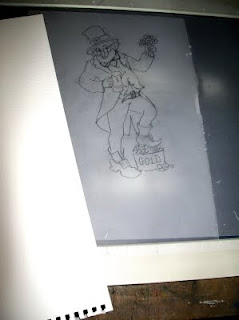
Then I print it out and make a tracing of it as I've found that tracing paper doesn't block out too much light from my lightbox - which, by the way, is actually my old, burnt-out A3 scanner that a neighbour kindly converted for me!
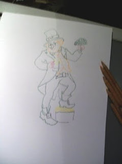
The next step is to place the watercolour paper over the tracing on the lightbox, and to lightly draw the image in pencil. Usually, I would then draw the image in ink, away from the scanner, using the pencil outline for guidance but not following it strictly, which could take away the 'freshness' from the drawing.

On this occasion, however, I decided to experiment and I carefully drew in the image with watercolour pencils. I wanted to see whether I could find a way to give the image quite a sharp definition but without the black ink-lines of a pen-and-wash drawing.
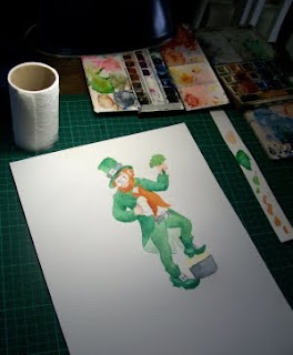
Then I painted it with watercolours, slightly blending the coloured pencil lines into the washes. This is the table in my attic where I work and you can see that I use pans of watercolour paint, rather than tubes, as I rarely need to make a large amount of wash for such a small painting (10.5" x 7.5" at this stage). In fact one of the tins you can just about see in the photo has been with me since my school days. Some of the pans have been replaced many time, others not at all!

You may notice a strip of watercolour paper to the right of my work - that was a tip I picked up from watching Quentin Blake's wonderful video clip of how he works on his illustrations. The strip is 'officially' for trying out the washes before using them to check they are the right colour and strength - but I noticed that for small amounts, Quentin Black actually mixes right there on the paper and I find that works brilliantly when I just want a small amount of each colour - it saves on cleaning out palettes as well!

Finally, I put in some detail with the watercolour pencils and then I blended them with a fine-tipped, slightly moist paintbrush to tidy the whole thing up. Next, the image was scanned into the computer at 300 dpi to make sure that the whole card design that will be submitted is the correct size. (I've recently discovered the usefulness of the 'Canvas Size' button in Photoshop or paint.net for adjusting to the exact dimensions.)
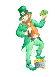
And here he is - a St Patrick's Day leprechaun!

All that's needed now is the caption, for which I will probably use Photoshop as my lettering isn't on of my strong points! Suggestions for the caption/greeting most welcome!

Tuesday, 12 January 2010

Selling Art Online - Tips and Warnings

I think my last post may have come across as a tad negative about selling through print-on-demand websites. I wanted to forewarn anyone thinking of selling their art online, that it may not be quite as simple as you may have been led to believe. However, I do think it’s worth a bit of hassle at the beginning and I’ve thought of a handful of tips that might smooth your path if you are even newer to online selling than I am -

Tips

  • There are at least half a dozen print-on-demand websites you can use to sell your art and design. Be aware that they all differ slightly in their modus operandi so, unless you are very computer-savvy and have a pretty clear head, don’t sign up for all of them at once.
  • Read the websites’ forums, even if they don’t seem to apply to you at the moment – they may do later on! Importantly, don’t be afraid to ask questions on the forums – other members and the website’s staff can be tremendously helpful. Some experienced ‘sellers’ will even volunteer to showcase your work on their blogs and lenses and you don’t want to miss out on an opportunity like that!
  • Don’t think that once you have uploaded your artwork you can just sit back and wait for the money to roll in. Expect to spend time promoting your online ‘stores’. Someone advised me that you need to spend 80% of your time and effort on marketing and 20% on creating! Yes, these websites offer you a world-wide market but the other side of the coin is that the competition is global too. There are a lot of artists out there wanting to sell their work so it’s essential to find ways to make sure that yours gets seen. If, like me, you are the kind of person who mainly uses the internet for email and surfing the net, this could take up quite a lot of your time.
  • Scour the internet to find helpful tips and advice – there are a great many really useful ‘How to’ articles, blogs and lenses, available to you at the click of a button, such as this one: http://www.makebigart.com/2009/06/do-i-need-a-facebook-fan-page/ This one has so many useful links within it that it took me a whole afternoon to follow them up – you have been warned! http://emptyeasel.com/2007/07/02/9-reasons-why-every-artist-should-have-their-own-art-blog/

  • Above all, if at times you feel you are drowning in ‘tags’ and ‘keywords’ , ‘widgets’, ‘gadgets’ and ‘applications’, DON’T PANIC - you are not alone!

Picasso said ‘I’m always doing things I can’t do, that’s how I get to do them’.


And now I’m planning to reward myself for all the ‘computer-work’ I’ve ploughed through recently and take a bit of time out to enjoy myself making art – results, hopefully, in a day or two....

Monday, 11 January 2010

Just beginning to make money from my art......

Welcome to my first ever blog! There are all kinds of ‘artist’s blogs’ out there on the net – some simply online galleries, others have illustrated running commentaries on the progress of individual pieces or whole projects, while others are full of useful information, with more text than images. So for a while I’ve been pondering what sort of form my blog should take.

I’m yet another one of those countless artists who claim to have been born with a pencil or paintbrush in my hand. But apart from a short spell of selling my pastel paintings in solo exhibitions about five years ago, I’ve never ‘done anything' with my art – until now! Other things have always got in the way, mainly earning my living as a primary school teacher. But last year, at the ripe old age of 65, in a sudden fit of ‘it’s now or never’, I decided it was time to take my art seriously – which, of necessity, means making some money from it in the not too distant future!

So far it’s been a huge learning experience and the money has only just started to trickle in. So I’ve decided to post notes on my new ‘journey’, a concoction of tips and health warnings that I hope may be helpful to artists who are just starting out - with a generous sprinkling of images of my artwork thrown in. Much as I enjoy writing, this is an ‘artist’s blog’ after all!

Having spent nearly a year of sending my greeting card designs to publishers, with nothing but a ‘near miss ’ in the summer to show for it, money was beginning to get tight. So about six weeks ago I decided to look into something that had been on my mind for a while - selling my artwork and designs through online Print-on-Demand websites. It seemed like such a simple idea, leaving me free to get on with the bit that I'm best at, creating the art!

Six weeks later my head is reeling from all the new and, to me, alien vocabulary that I've had to acquire in order to set up my 'online stores' and promote them! A very steep learning curve and I'm sure I haven't really 'got there' yet. Meanwhile I haven't had time to produce a single piece of art or design - but on the other hand, people from all over the world have been buying greetings cards that I've designed and that's great!

Maybe it was a mistake to sign up for four different 'PODstores' at once - but once I'd successfully set up the first one, my enthusiasm got the better of me. The thing that has most challenged my little old grey cells is that, although all the sites work on the same basic principle - sign up, upload images, make them into products and sell them! - they each have their little individual quirky differences! And that's enough to thoroughly confuse a 'newbie' (or should I say 'oldie' in view of my age? Or maybe an old-newbie?) like me!

I was fine with the first two, Greeting Card Universe and Zazzle requiring me to 'select categories' for my cards and gifts - though some of the categorisation rules on Greeting Card Universe were beyond my understanding! Why, for instance, was I not allowed to put a card for congratulating someone on passing their driving test in the 'Driving Test Congratulations' category? The note I received said that nothing in the image or text referred to passing a driving test. Well, what was the girl with car keys in her hand, scattering torn up L-plates and heading for a car, with the text 'Congratulations, you've passed your test' all about? I did query that one and it was allowed through. But there were others that totally dumbfounded me and I just did as I was told! For instance, a picture of two boats on a lake in Wales had to go in the 'Places/cities' category. Crazy! On the whole, though, it all seemed quite straightforward.

But when I joined Printfection, not only was the order of doing things so different that I got in a complete muddle, sometimes even forgetting to add the commission I wanted because it's done automatically on the other two sites! And I kept getting stern-looking messages about not having created any sections in my store. So what are sections, I wondered for a few days and then decided to take a guess that they were the same thing as 'categories' and I'm still hoping I guessed right! I don't much like the fact that my 'images' are classed as 'unorganised', especially since I know I can be very disorganised so it's rubbing salt into the wounds. If only I knew what I have to do to 'organise' them....

It's all very exciting, though, if somewhat bemusing, and every time someone buys one of my cards and $0.56 is added to my account, I'm straight onto a dollars to GBP conversion website to work out how much I've earnt! Designing greeting cards is something I've wanted to do ever since I was a teenager - didn't go to Art College because my mother was sure they were full of Beatniks but I've always painted, drawn, screenprinted, designed scenery for amateur dramatics and so on and so forth....so, even though the money's not exactly going to make me rich, there are other rewards.

Today, however, I really depressed myself. Some really organised person had bought one of my Valentine Cards from Greeting Card Universe so I had a look on Zazzle to see whether my Valentine Cards came up on the first couple of pages. When I got to page 60 and still no sign of them, I checked how many Valentine Cards there are on the site - only 52,000+ - I'm sure that if you visited all the card shops in my nearest city, you wouldn't find as many as that! So what chance is there that mine will ever see the light of day, poor things?

Unless, of course I give them a break and post some quick scans of them here......


Valentine's Cards