Now that we're beginning to see signs of spring and the days become, hopefully, lighter and
longer, the bright sunshine can make our homes begin to look a little 'tired' and in need of
refreshment. So, because our surroundings are so important to our
mood, I'm going to suggest some ways we can revive and refresh them
without breaking the bank!
If we're lucky enough
to get a sunny springtime, the downside is that the sunlight can show up
all sorts of little defects that we didn't notice in the winter. It's with good
reason that we talk about 'Spring-cleaning' and not 'Summer-, Winter-
or Autumn-Cleaning'.
Several world religions
traditionally incorporate a good, thorough house-clean into their New
Year celebrations. You can read about the
traditional Spring-clean that is part of the Persian New Year or
Nowruz HERE. (It's also traditional
to spring-clean the home in readiness for the Hindu festival of
Diwali - though that falls in the Autumn in the Northern Hemisphere!)
But suppose we decide
that our home needs something more than just an extra-good clean? What if the change of year has instilled in us a wish for a more
fundamental change - some redecorating, maybe, some new soft
furnishings? An exciting, but possibly also a daunting thought,
especially if we don't have a lot of money to spend.
I hope to be able to
show you that with careful planning, you can achieve a fresh new look
for any room, even if your bank balance is still reeling from your Christmas expenses.
First of all, a couple
of very general tips about planning your home decor. (If you already
know exactly how you want your room to look, you can skip this
section!)
1. Generally speaking,
horizontal lines and shapes give a more restful ambience. You can use
this to good effect in furniture, patterned wallpaper, rugs and
carpets and even in the art that you hang on your walls.
Diagonal lines, such as
in chevrons, can have the opposite effect - ie stimulating. So, for
instance, you could achieve a calming, restful bedroom or bathroom
with the accent on horizontal lines and use diagonals or chevrons for
a shower room where you may feel you need an enlivening effect. (I've
read that the seaside is the best place to be if you are anxious
because the lines of the beach and sea are horizontal, while the
zigzag effect of mountains is better for depression!)
2.There are plenty of
websites that explain the use of colour for psychological effect in
our homes. Here is just one with a useful diagram - though I would
disagree about the bedroom. Blue is generally thought to be the most
restful colour for a bedroom.

Image from the 'Freshome' website
When I was studying
Interior Design, we spent months on the Colour Theory module. I
learned about all the various special names for the different colour
combinations - triadic, split complementary and so on. Here they are on this excellent blog: 'Colours and Materials'

When I proudly showed some of my colour schemes for
rooms that I had based on these theories, to an experienced Interior Designer,
he winced and asked me whether I'd actually like to live with any of
them - and of course, the answer was a resounding 'no'! So much for colour theory!
But in the course of
gutting and refurbishing the several large Victorian and Edwardian homes that I've lived in, I've developed a
'colour theory' that works for me and you might be interested to try it.
So here's my top secret colour scheming tip!
When I
make a 'mood board' for each area of the house, with snippets of
wallpaper, fabric, photos cut out of magazines etc,
I try to make sure that, one way or another, I include some Red,
Blue, Green and Yellow. That way I achieve a harmonious, balanced
effect.
Before you raise your
eyebrows in horror, I don't end up with horribly garish rooms and
this is why:
- I don't
include equal amounts of each colour in any room. I choose a main
colour, according to the room's function. And then I add in smaller amounts or maybe just accents of the other colours.
- Also, I rarely use the
fully saturated primary or secondary colour. What does that mean in
practical terms? Here are some examples from my home -
Red can be terracotta
floor tiles or any shade of pink or red/orange spice colours.

Brass ornaments and accessories such as coal buckets also count as 'yellow'.
Green is most often
provided by houseplants or landscape paintings.
Blue can often provided by collections of blue and white china, either on
shelves or hung on the walls.

So how can we apply all
this 'theory' to planning our home makeover? Well, it rather depends
on how much of a change you want. Do you need to completely
redecorate? Really? You might well be able to achieve a fresh new look
by just changing some of the accessories. It's up to you. But in any
case, I suggest you make a mood board. You can either do it the
old-fashioned way with a physical clipboard and paper; or digitally, collecting together items for consideration on a site such as Pinterest
or Polyvore.
Decide on the the
main colour in your scheme - red, blue, green or yellow? Spend some time looking through 'home decor' magazines and searching the internet and you'll soon come to recognize the colours you are drawn to. But if you still need inspiration, and you're looking to follow the latest trends, why not check the
Pantone colours for the coming year? This year, there are two Pantone
'colours of the year' - Quartz Pink and Serenity (Blue). Read all
about them here - Pantone Colour of the Year, 2016
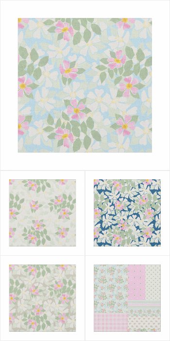
You may have noticed
that my 'Rosy Posy' Fabric Collection at the top of this post,
features some pinks and blues. And this could be a
starting point for your makeover, especially if you're looking to achieve a pretty 'country' look.
But wait, if you look closely, the
main 'Rosy Posy' pattern contains not only pink (the 'red' element)
and light blue in some of the backgrounds and coordinates, but there are also hints of yellow in
the dog rose centres and green in the leaves - making up a nicely
balanced colour composition!

If you are planning a complete makeover, including walls and flooring, the background colours
to the four main patterns - white, deep blue, pale sky blue and taupe
may suggest ideas for your walls, carpets or main furniture
coverings. And if you choose one or more 'Rosy Posy' items, you can rest
assured that any accessories or fabrics you choose from the
collections below, will harmonize with the overall scheme.
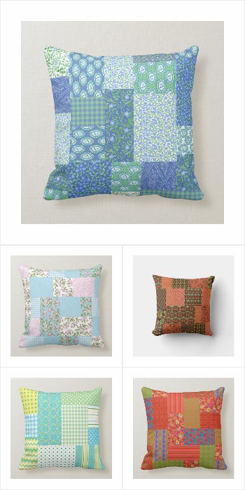
So here are my four 'Rosy Posy' collections -
1. A very pretty and feminine collection of coordinating fabrics based on a Dog Rose theme, named 'Rosy Posy'.
Available in seven different types of fabric, these floral patterns are suitable for home decor, dress-making and craft projects as well as being the perfect starting point for a patchwork quilt. As well as ordering by the yard, fat quarters and swatches are also available. The original Dog Rose design was created from a hand-painted paper collage and many products with the dainty 'Rosy Posy' patterns are available in my Posh and Painterly store.
Click on the image below to see the full collection -
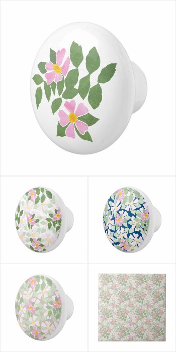
2. A pretty collection of coordinating accessories for the Bedroom or Bathroom in a vintage, shabby chic style.
Excellent as gifts, the pattern of pink and white Dog Roses on white, taupe, deep blue and sky blue backgrounds is from a hand-painted paper collage by Judy Adamson and you can see the full range of 'Rosy Posy' gifts and greeting cards in my Posh and Painterly Zazzle store.
Click on the image below to see the full collection -
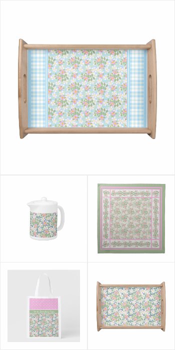
3. Create a nostalgic, shabby chic look with this pretty and feminine collection of coordinating kitchen and dining products, with Dog Rose patterns in pastel shades. Just a small selection of delightful products from the Posh & Painterly 'Rosy Posy' collection by Judy Adamson. Visit my Posh and Painterly Store and select Floral Mini-prints to see the full collection of 'Rosy Posy' Greeting Cards and Products.
Click on the image below to see the full collection -
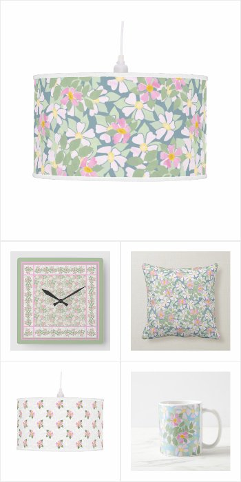
4. Here's another collection of pretty and feminine, coordinating home decor products with Dog Rose patterns in pastel shades.
Just a sample of charming products to mix and match, from the Posh and Painterly 'Rosy Posy' collection by Judy Adamson. Be sure to check out my Posh & Painterly Store and select Floral Mini-prints to see the full collection of 'Rosy Posy' Greeting Cards and Products.
Click on the image below to see the full collection -
I very much hope that
you have found these home decorating tips useful!
And if you're interested in reading
about the chance in a million that brought my 'Rosy Posy' pattern
into being, you can read all about it in my earlier blog post,