Showing posts with label posh and painterly. Show all posts

Thursday, 21 April 2016

Laura Ashley and Pretty Floral Home Accessories


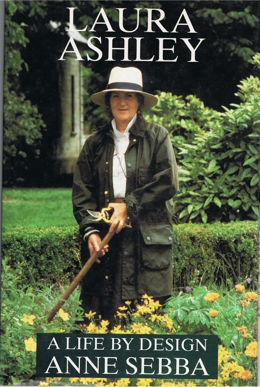
I've just finished reading 'A Life by Design', a biography of Laura Ashley, written soon after her tragic fall, from which she never regained consciousness, at the age of 60. 


I read the book when it was first published in 1990 but at that time, I read it from the point of view of a Laura Ashley Home Furnishings customer, having used gallons of Laura Ashley Navy paint in the refurbishment of my Edwardian home in Norwich. I even painted the outside of the re-sprayed, genuine ball-and-claw-footed bath that we found in an outhouse when we bought the house. 

And here's the 'Laura Ashley Navy' front door of my next (Victorian) home!


But this time around, I read it as a designer, more specifically a surface pattern designer with a strong interest in designing textiles for fashion and home furnishings.

And it was as if I was reading it for the first time. So many things jumped out at me that hadn't really interested me back in 1990.

First and foremost, I was quite shocked to read that Laura Ashley wasn't exactly a designer! Neither she nor her husband, Bernard, could draw and of course, they started their business well before the days of computers!

The legendary little 'sweater scarves', table mats and tea-towels that they printed on the kitchen table of their Pimlico flat in the 1950s, ('fixing' the colour by baking in the oven, where some fell down and burnt!), these small items had bold geometric shapes a patterns, which was all that their rather primitive printing equipment could cope with.


But they sold well, because Audrey Hepburn had popularised the 'sweater scarf' in the popular film, 'Roman Holiday'.


However, Laura was already intensely interested in tiny floral printed and striped fabrics. She had worked as a secretary at the National Federation of Women's Institutes and when she visited one of their handicraft exhibitions at the Victoria & Albert museum, she realised that women were capable of working at home to produce textiles that were of museum standard. She was particularly struck by the patchwork and scoured the shops to find suitable fabrics so that she could make her own while awaiting the birth of her first child.

As we moved through the 1960s, fashion trends changed dramatically. Out went the full skirts with hooped petticoats and in came the mini-skirt and sharply cut dresses and coats with geometric patterns. In case that was before your time, you can get a flavour of the era HERE 

And it was in 1968 that Laura Ashley - or rather, Bernard, her husband, opened their first dress shop, selling dresses that were almost shockingly different! Bernard oversaw the printing, dealt with the marketing and business side of things - so, given that she was not a designer, in the usual sense of the word, what part did Laura play?

Well, she did supervise the making up of the garments in Wales and researched patterns to use, spending a great deal of time in libraries and museums, pouring over antique pattern books and so on. 

But Laura's essential contribution to what was becoming a successful business venture, was her 'unique idea'!


Coming from a Welsh non-conformist background, Laura Ashley had her 'puritanical' side. But she was also a romantic, she loved the countryside and nature and she was more drawn to the fashions of bye-gone ages than to the current trends. She may have had some rather naive ideas about how a working farmer's wife would have dressed in days of yore, but her dresses were based on earlier styles and the fabric patterns were, at least to begin with, mainly historical.


She firmly believed that women were more interested in dressing to look beautiful than in following the latest fashions. And she also took the view that the more you cover up - long skirts, long sleeves etc - the more alluring you will be! 

Put those two beliefs together and you have the classic Laura Ashley dress of the late-Sixties and Seventies. 

'Pretty but Prim' would be how I would describe those early dresses that turned the Laura Ashley brand into household name. 

I remember my first visit to a Laura Ashley dress shop, when I was staying with my sister-in-law in Oxford - to me it was heaven on earth! In fact I never bought a Laura Ashley dress because I loved dressmaking and made my own in similar styles. But I do still have a full-length Laura Ashley nightdress, complete with pin tucks, tiny, concealed, pearl buttons, and lace-trimmed high collar and long sleeves. It's somewhat the worse for wear now but somehow I don't want to turn it into a cleaning cloth so it stays at the bottom of my drawer!


Looking back, it seems strange now that the only fashion choices at that time were limited to 'bold geometric' or 'romantic with frills'! Today's fashion trends are far more eclectic so that you could almost believe that 'anything goes'. 

But even so, I think those two main, sharply contrasting, trends are still around.

Alongside the 'funky', 'quirky', sometimes bordering on 'outrageous' fashions, you only need to delve into Pinterest or visit an online store such as Etsy to see that nostalgic, romantic and downright 'pretty' is still as popular as ever.


Of the two design strands, the nostalgic, vintage 'look' is easier to live with in the long-term. Eventually, in the 1980s, Laura Ashley branched out into Home Furnishings. I'm only surprised she left it so long. 

I used Laura Ashley Brick Red wallpaper on the staircase, above the dado rail, in my Victorian home in Hereford. 

And the colour was the perfect backdrop for the pictures I hung on that wall. 


I also still use a Laura Ashley tea-cosy! Like all of her products, the quality is head and shoulders above most others.


Sadly, I've never found a good replacement for my Laura Ashley heavy cotton lace curtains, that looked fabulous, hung over slimline, navy blue Venetian Blinds, in three different homes, from 1987 - 2013, when they finally started to fall apart, as you can see by the hole down near the hem!


Bright, bold and minimalist is exciting, but perhaps more suitable for clothing than for home furnishings, which we expect to last somewhat longer than a dress, bought and worn today, possibly discarded a few months later! That is not to say that the more 'modern' style doesn't look great in an office building or a city apartment.

But for a home, especially a period home, the vintage, 'shabby chic' is much more comfortable to live with, day in day out, for a number of years.

I'm far from suggesting that we decorate and furnish our homes as faithful replicas of times gone by. But our surroundings do affect our mood and some of the more outlandish patterns currently available seem to have an almost 'aggressive' feel to them. Whereas a few 'pretty things' can soften the edges of our daily existence.

So here are a couple of my Home Furnishings Collections - not exactly 'Laura Ashley' but also based on floral designs and patterns -


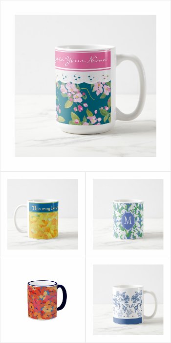
100+ Floral Coffee Mugs - some ready to personalize:

Click on the image below to see the full Coffee Mug collection -


100+ Floral Pillows or Cushions - arranged by colour:

Click on the image below to see the full Pillow collection -
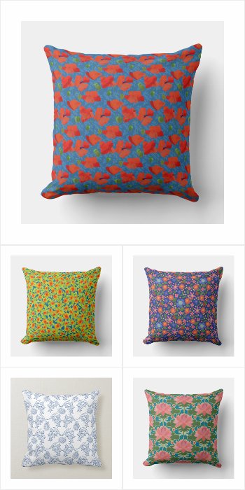
And just by the way, a floral mug or throw pillow or cushion, would make a wonderful Mother's Day gift or a birthday present for your mother!


Thursday, 24 March 2016

Tips for a Budget Spring Home Decor Makeover


Now that we're beginning to see signs of spring and the days become, hopefully, lighter and longer, the bright sunshine can make our homes begin to look a little 'tired' and in need of refreshment. So, because our surroundings are so important to our mood, I'm going to suggest some ways we can revive and refresh them without breaking the bank!

If we're lucky enough to get a sunny springtime, the downside is that the sunlight can show up all sorts of little defects that we didn't notice in the winter. It's with good reason that we talk about 'Spring-cleaning' and not 'Summer-, Winter- or Autumn-Cleaning'.

Several world religions traditionally incorporate a good, thorough house-clean into their New Year celebrations. You can read about the traditional Spring-clean that is part of the Persian New Year or Nowruz HERE(It's also traditional to spring-clean the home in readiness for the Hindu festival of Diwali - though that falls in the Autumn in the Northern Hemisphere!)

But suppose we decide that our home needs something more than just an extra-good clean? What if the change of year has instilled in us a wish for a more fundamental change - some redecorating, maybe, some new soft furnishings? An exciting, but possibly also a daunting thought, especially if we don't have a lot of money to spend.

I hope to be able to show you that with careful planning, you can achieve a fresh new look for any room, even if your bank balance is still reeling from your Christmas expenses.

First of all, a couple of very general tips about planning your home decor. (If you already know exactly how you want your room to look, you can skip this section!)

1. Generally speaking, horizontal lines and shapes give a more restful ambience. You can use this to good effect in furniture, patterned wallpaper, rugs and carpets and even in the art that you hang on your walls.

Diagonal lines, such as in chevrons, can have the opposite effect - ie stimulating. So, for instance, you could achieve a calming, restful bedroom or bathroom with the accent on horizontal lines and use diagonals or chevrons for a shower room where you may feel you need an enlivening effect. (I've read that the seaside is the best place to be if you are anxious because the lines of the beach and sea are horizontal, while the zigzag effect of mountains is better for depression!)

2.There are plenty of websites that explain the use of colour for psychological effect in our homes. Here is just one with a useful diagram - though I would disagree about the bedroom. Blue is generally thought to be the most restful colour for a bedroom. 

Image from the 'Freshome' website


When I was studying Interior Design, we spent months on the Colour Theory module. I learned about all the various special names for the different colour combinations - triadic, split complementary and so on. Here they are on this excellent blog: 'Colours and Materials'


When I proudly showed some of my colour schemes for rooms that I had based on these theories, to an experienced Interior Designer, he winced and asked me whether I'd actually like to live with any of them - and of course, the answer was a resounding 'no'! So much for colour theory!

But in the course of gutting and refurbishing the several large Victorian and Edwardian homes that I've lived in, I've developed a 'colour theory' that works for me and you might be interested to try it. 

So here's my top secret colour scheming tip! 
When I make a 'mood board' for each area of the house, with snippets of wallpaper, fabric, photos cut out of magazines etc, I try to make sure that, one way or another, I include some Red, Blue, Green and Yellow. That way I achieve a harmonious, balanced effect.

Before you raise your eyebrows in horror, I don't end up with horribly garish rooms and this is why:

- I don't include equal amounts of each colour in any room. I choose a main colour, according to the room's function. And then I add in smaller amounts or maybe just accents of the other colours.

- Also, I rarely use the fully saturated primary or secondary colour. What does that mean in practical terms? Here are some examples from my home -

Red can be terracotta floor tiles or any shade of pink or red/orange spice colours.


Yellow can be light 'yellowish' woodwork, or, as in my kitchen, maple-effect worktops. Or the various shades of cream, 'natural' colours like 'wheat' or 'oatmeal' or 'sandy' yellows for walls or flooring. The 'sandy' colour pictured here is by Laura Ashley but you can find similar colours in most paint charts.


Brass ornaments and accessories such as coal buckets also count as 'yellow'.


Green is most often provided by houseplants or landscape paintings.

Blue can often provided by collections of blue and white china, either on shelves or hung on the walls.


In my shower room, for example, the walls are an Edwardian shade of green, the floor tiles are light blue, the stool and the loo-seat are a yellowish pine colour and the towels are burnt orange (red) as are the candles. The Paul Klee print hung on the wall brings all these colours together. And it's all set off by white tiles and paintwork- but that's just me, I love white, but too much of it leaves a house of the age of mine looking rather 'undressed', except in the bathrooms!


So how can we apply all this 'theory' to planning our home makeover? Well, it rather depends on how much of a change you want. Do you need to completely redecorate? Really? You might well be able to achieve a fresh new look by just changing some of the accessories. It's up to you. But in any case, I suggest you make a mood board. You can either do it the old-fashioned way with a physical clipboard and paper; or digitally, collecting together items for consideration on a site such as Pinterest or Polyvore.

Decide on the the main colour in your scheme - red, blue, green or yellow? Spend some time looking through 'home decor' magazines and searching the internet and you'll soon come to recognize the colours you are drawn to. But if you still need inspiration, and you're looking to follow the latest trends, why not check the Pantone colours for the coming year? This year, there are two Pantone 'colours of the year' - Quartz Pink and Serenity (Blue). Read all about them here - Pantone Colour of the Year, 2016

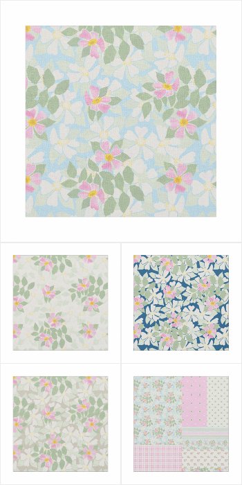
You may have noticed that my 'Rosy Posy' Fabric Collection at the top of this post, features some pinks and blues. And this could be a starting point for your makeover, especially if you're looking to achieve a pretty 'country' look. 

But wait, if you look closely, the main 'Rosy Posy' pattern contains not only pink (the 'red' element) and light blue in some of the backgrounds and coordinates, but there are also hints of yellow in the dog rose centres and green in the leaves - making up a nicely balanced colour composition!


If you are planning a complete makeover, including walls and flooring, the background colours to the four main patterns - white, deep blue, pale sky blue and taupe may suggest ideas for your walls, carpets or main furniture coverings. And if you choose one or more 'Rosy Posy' items, you can rest assured that any accessories or fabrics you choose from the collections below, will harmonize with the overall scheme. 

So here are my four 'Rosy Posy' collections - 

1. A very pretty and feminine collection of coordinating fabrics based on a Dog Rose theme, named 'Rosy Posy'. 
Available in seven different types of fabric, these floral patterns are suitable for home decor, dress-making and craft projects as well as being the perfect starting point for a patchwork quilt. As well as ordering by the yard, fat quarters and swatches are also available. The original Dog Rose design was created from a hand-painted paper collage and many products with the dainty 'Rosy Posy' patterns are available in my Posh and Painterly store.

Click on the image below to see the full collection -


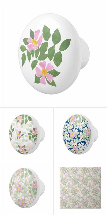
2. A pretty collection of coordinating accessories for the Bedroom or Bathroom in a vintage, shabby chic style. 
Excellent as gifts, the pattern of pink and white Dog Roses on white, taupe, deep blue and sky blue backgrounds is from a hand-painted paper collage by Judy Adamson and you can see the full range of 'Rosy Posy' gifts and greeting cards in my Posh and Painterly Zazzle store.

Click on the image below to see the full collection -


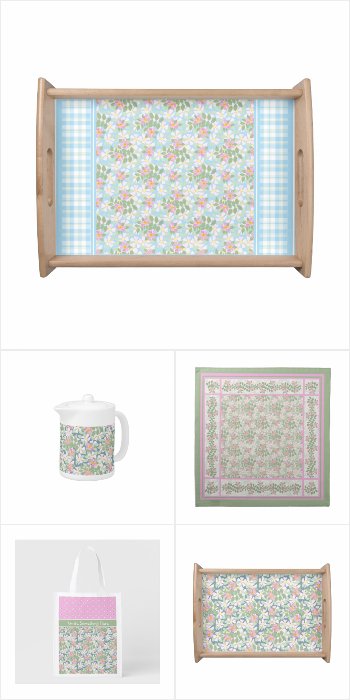
3. Create a nostalgic, shabby chic look with this pretty and feminine collection of coordinating kitchen and dining products, with Dog Rose patterns in pastel shades. Just a small selection of delightful products from the Posh & Painterly 'Rosy Posy' collection by Judy Adamson. Visit my Posh and Painterly Store and select Floral Mini-prints to see the full collection of 'Rosy Posy' Greeting Cards and Products.

Click on the image below to see the full collection -


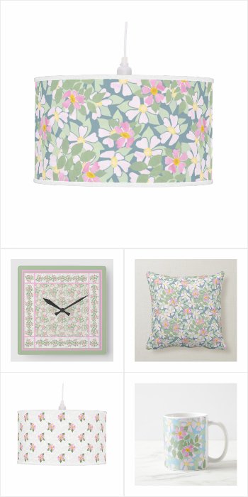
4. Here's another collection of pretty and feminine, coordinating home decor products with Dog Rose patterns in pastel shades. 
Just a sample of charming products to mix and match, from the Posh and Painterly 'Rosy Posy' collection by Judy Adamson. Be sure to check out my Posh & Painterly Store and select Floral Mini-prints to see the full collection of 'Rosy Posy' Greeting Cards and Products.

Click on the image below to see the full collection -


I very much hope that you have found these home decorating tips useful!

And if you're interested in reading about the chance in a million that brought my 'Rosy Posy' pattern into being, you can read all about it in my earlier blog post,


Thursday, 25 February 2016

How to Mix and Match Fabrics for Crafts and Girls' Dresses


Sadly I don't think I shall see much blossom on my fruit trees this spring. 

As you can probably see from the photo above, they've just been subjected to a much overdue pruning this week!


But luckily I've taken lots of photos of the lovely, sweet-scented blossoms in years gone by, so I was able to use some of those photos to paint the motifs for my 'Apple Blossom' pattern collection in watercolour.


As usual, I've created a main pattern with three different background colours, plus three related 'leafy maze', hand-drawn patterns, a 'floral' Polka Dot, a colour-coordinated Check Gingham and two Faux Patchwork patterns -


You can see them all in my Posh & Painterly store.


There is always an essential practical element in designing, as opposed to creating Fine Art. And, as I work on a collection of pattern designs, part of my mind is always mulling over what my patterns can best be used for.

And last week, when I was shopping in town, I spotted a new shop, 'A Child's Boutique' (facebook page) and I immediately made the connection with the collection of patterns I was working on!


It was the window display that caught my eye because the little girls' dresses in the window were so similar to the ones I used to make for my daughters when they were little, back in the late '60s and '70s!


I've always loved the idea of mixing and matching fabrics and the boho/hippie style of that era was just right for the dresses I made. 

It's a style that has come and gone over the years and although it has never really gone out of fashion, it seems to be enjoying a resurgence at the moment!


Here's another (online) store, Lily and Sid, carrying frocks for little girls and the boys' outfits tend towards the mix'n'match as well.


The great thing about making dresses for little girls is that it can be quick - unless you go in for hand-smocking, that is! - and because they take so little fabric, they are not going to break the bank. 

The bonus is that you may have enough left over from one dress to make a frill, a yoke or at least some patch pockets on another one!


Trim with ric-rac braid and/or broderie anglaise for added cuteness! 


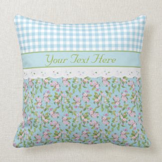
Here's a cushion I created for my Posh & Painterly store, just as an example - might give you some ideas for how to mix and match these 'Apple Blossom' fabrics!


The Faux Patchwork pattern would also look good with one of the other patterns used for the yoke or puffed sleeves - or underskirt, knickerbockers or frill! - for a pretty, nostalgic 'Holly Hobbie' look!


And here are three ladies' tank tops I've created to give you an idea of how the main 'Apple Blossom' pattern looks made up into a garment.


I'm gradually adding more home and fashion accessories to my Posh and Painterly store - I think some of my 'Apple Blossom' collection of home accessories would look great in a bedroom, particularly as so many of the patterns are based on the colour blue, which is restful and some say it makes for a good night's sleep.


By the way
my 'Apple Blossom' collection of fabrics is now also available for sale,
 along with many of my collections, 
on the 


(uk) website


And here are all my fabric collections so far, on Pinterest!

My
Fabric Collections
on

I hope I've inspired you who love to sew, to create some pretty little boho-chic dresses that will delight any little girl. 

I'd love to see your photos of them if you do!


Thursday, 21 January 2016

Primroses and Violets for a February Birthday


Finding a different birthday card for a friend or relative, year after year, can be a challenge, especially if we're looking for something that will be special to that person.

I've just been ordering birthday cards for my friends and trying to remember which ones I sent them last year! 

Of course it helps that so many of the cards we can buy online can be personalized. It's not difficult to do and yet it can make a big difference because the recipient will know that we didn't just rush out to the nearest store and pick up the first card we found!

A 'photo card' is another option - slightly more complicated to create but not too daunting, especially once you've done it a few times.

And here's another idea - take advantage of the 'Birth Month Flowers'! Each month has at least one well-known flower designated to it. You can read about them on this website. Some of the suggested flowers seem completely out of season for me, here in the UK.

But both of the February Birth Month Flowers, the Violet and the Primrose, are very familiar to me and relate to the right time of year - more or less!


I have plenty of wild violets in my front garden! When I first moved into my house, I tried to get rid of them to make room for the flowers I wanted to plant. But because a quite rapidly growing Magnolia Tree spreads its roots throughout the garden, it was a losing battle. So I gave up and allowed my front garden to become a 'woodland' area with the only plants that enjoy the shade and the poor soil - mainly bulbs, lilies of the valley and the violets! The lilies of the valley are gradually spreading from one side and the violets from the other and they almost meet in the middle and I'm wondering which will win when they eventually meet!

Here's a webpage about 'How to Grow Wild Violets'  - not that mine have needed any help from me; they manage pretty well all by themselves. But I didn't know that they are edible until I read this article.


As I wrote in this earlier blog post, these little Wild Violets don't add a lot of colour to a garden, especially where they are often almost hidden amongst the fallen leaves. It was only on closer inspection for the purposes of painting them, that I 'got to know them' and began to appreciate them. They certainly live up to their description of 'Shrinking Violets', another of my earlier blog posts!


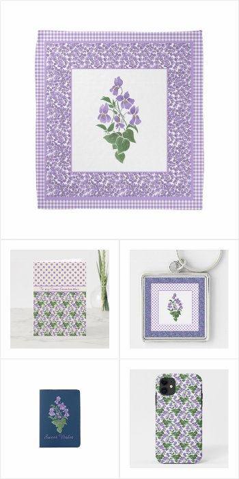
A Birthday Card or Gift with a 'Sweet Violets' pattern would certainly be special, especially as many of the cards and gifts in my 'Sweet Violets' collection are ready for you to personalize! So go ahead and choose from dozens of 'Sweet Violets' gifts and make it even more personal with your own customization. There's even a choice of 'Sweet Violets' wrapping papers, tissue giftwrap and gift bags to add the finishing touch - and don't forget that if you see a design you'd like on a different product, you can contact me through my store and I'll create what you need, at no extra charge, usually well within a couple of days.

Just click on the image below to see the full collection -


February does seem a little early to be seeing the other February Birth Month Flower - the Primrose. I associate them with springtime, but here in the UK they are usually at their best around Easter Time.

Here's my earlier blogpost about how I used to enjoy going out to the woods to pick them as a child. There is some confusion about whether we are allowed to pick wild flowers - understandably because some are becoming rare in the wild now. But this article from the Wild Flower Society - Wild Flowers and the Law - clarifies the situation and, although the wholesale digging up of wild flower plants certainly doesn't help our countryside to flourish, it's fine to pick a posy of primroses, just as it was when I was a child.

The 'Primroses' image I've used to make the repeating pattern below began as a print I made in a screenprinting class almost 30 years ago! I was living in the centre of Norwich at the time, with not many opportunities to get out into the woodland to see the little pale yellow primroses growing in the wild. But I did - and still do! - often buy the larger cultivated primroses in a variety of bold colours to brighten up my front porch in winter. I've even grown them from seed in the past, which works out a lot cheaper! Sometimes you can plant these cultivated primroses out in the garden once they've finished flowering and if they thrive there, they provide a bright spot when there's very little colour around in the gardens.


And it was from a group like these that I drew my 'Primroses' motifs for the screen print and luckily I kept the original drawing so I was able to paint them in gouache to make the repeating patterns that have become popular!


Here are just a few ideas to make someone with a February Birthday feel really special! The primrose is one of the earliest flowers to bloom but you may not know that it happens to be one of the February Birth Month Flowers. So why not celebrate a February Birthday with a special 'Primroses' Birthday Card and a gift with this pretty Primrose pattern? There's also a range of 'Primroses' gift-wrapping papers, gift bags and even matching gift tags! And you'll find an even greater selection of 'Primroses' cards and gifts if you visit the 'Painterly Florals' section of my Posh & Painterly Zazzle store.

Just click on the image below to see the full collection -

Primroses for a February Birthday
Primroses for a February Birthday  


So, whether you choose Violets or Primroses you can be sure that the Birthday Girl, whatever her age, will appreciate your Birthday Card and Gift choice!