Showing posts with label springtime. Show all posts

Tuesday, 19 May 2015

Primroses Colour Palette for Springtime

What colour comes to mind when you hear the word 'primrose'?

I'm sure most of us associate primroses with the colour yellow - the particularly delicate, pale yellow of the wild primroses of springtime. I remember, as a child, travelling on the old steam trains in the Isle of Wight, you could look out of the window and see a 'carpet' of pale yellow! 

The wild primroses almost completely covered the grassy banks of the cuttings we passed through just before we went into a tunnel. Anywhere else, they would have been picked or even dug up for someone's garden. But it was probably too dangerous for anyone to venture down the steep slopes of the railway cuttings to pick them. So they were left in peace, to grow and multiply - a lovely sight in spring!

But cultivated primroses come in a wide range of colours!

Years ago I grew them from seed. But nowadays my lack of wide enough window sills for the seedlings, sends me off to the supermarket to buy the plants. (That's my excuse, anyway!)

I particularly like the pink-ish orange ones  - 


Sometimes I can't get enough of them all the same colour for the shelf in my front porch, so then I go for as many different colours as I can:


To me the different coloured flowers look fine - splendidly bright and cheerful! 

But when you look at all the colours together, I can't help feeling that there are too many colours, that some need to be eliminated to make a cohesive colour scheme.

So from this group of eight colours, we could pick out lots of different schemes.

I have chosen 2, 3, 4 and 6 for this traditional Islamic pattern:


But there are lots of other possibilities!
Which four would you choose?

You can save this pattern tile and experiment with it if you wish -


Tuesday, 5 May 2015

A Spring Landscape Colour Palette

I've never been drawn to the colours of the typical spring landscape.

Years ago - probably nearly half a century ago! - I'd paint little water colours of the countryside in winter with fingers almost too cold to hold my paintbrush. And the landscape colours of late summer holidays driving down through France have been know to get my creative juices flowing. 

But springtime? No - the colours of fresh green sprouting buds are just too acidic for my liking, strangely cold and harsh compared even to the winter colour palettes. However, here's an interesting spring colour palette - yes there are a couple of sharp, bright colours - the lemon yellow and the neon green.


So why do I quite like this photo of the park that I cross every time I go shopping, in spite of those bright greens and yellows? 

It's probably because those brilliant colours are offset by some wonderfully mellow tones, especially the colours of the copper beech trees that are more reminiscent of autumn. So that harsh, bright green and 'aggressive' yellow are just accent colours balanced by the more muted, subtle tones all around them. And that way, I find them less aggressive!

But even so, if I were using this palette for an interior or for an outfit or a pattern, I think I'd choose just one of the bright accent colours and it would probably be the green. In fact the six colours on the right-hand side could make a good combination, as could the whole of the top row . . .

Which ones would you choose?


Thursday, 13 March 2014

Spring Sunshine to celebrate Norooz and the Vernal Equinox!


Spring Sunshine Repeating Pattern and some coordinates


What a change in our weather! 

The interminably long and stormy winter has given way, at last, to warm, dry sunny days with brilliant blue skies. Spring has definitely arrived here in Wales!

It’s already our ‘meteorological spring’ – that one began on March 1st. But there’s another week to go before the Spring Equinox on March 20th, which most people regard as the start of Spring. And that falls around the same time as the Persian New Year, Norooz, which you can read all about here.

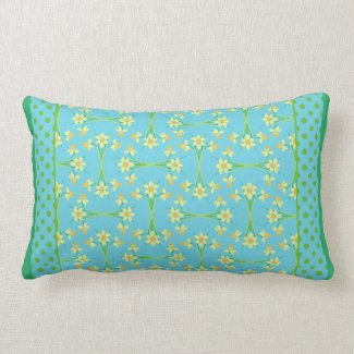
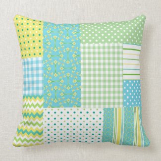
Chic Turquoise Lumbar Pillow: Daffodils Polka Dots

The start of spring seems like a very good time to celebrate a new year, with all the new beginnings in Nature appearing! 

But it’s a very busy time for the greeting card designer! Not only do we have St David’s Day Cards, Easter Cards and Mother’s Day cards to work on, as well as, maybe, March Birthday Cards – it’s also time for our St Patrick’s Day Cards . . .  and then there’s Norooz to think about as well! 


Just as well I designed mine while the weather was still wintry, before I was tempted out into my garden! 
But it was only when the rain eased off and the temperature began to rise that I thought about making a Spring Door Wreath! 

It would never have occurred to me if it weren’t for Pinterest and it was only because I found an old wreath base amongst my Christmas decorations that I began to take the idea seriously. 

When I looked more closely at the base I’d found, I decided it would be a shame to remove the dried flowers from it and, with a bit of refurbishing, it looks quite at home against the white boards on my landing.


So, having decided not to use this wreath base after all, I set about looking online to see where I could buy a new similar base – and immediately came across some excellent instructions for making my own!


(instructions from 'Modern Country' a blog that I'll definitely be returning to!)


I have plenty of honeysuckle and ivy in my garden to provide the materials. 

The honeysuckle opposite my kitchen window is where the sparrows congregate for a gossip and the blackbirds have even nested in it a couple of times so I would have preferred to take what I needed from the ivy!


But knowing how tough ivy is when I try to remove it from places where it shouldn’t be spreading to, I was really surprised to find that it was more inclined to snap than the honeysuckle. 

Here are a few photos of the various stages to prove I did actually make it from scratch - which still amazes me!


Sorry about the difference in colours - it is the same wreath
but I changed to using my 'proper' camera for the final pics
because I'm not yet very good at taking photos with my phone!

Wrapping the last ‘binding’ round was slightly scary – I was sure the stems would break. But I found that as long as I bent them gently, a little at the time, they cooperated perfectly. (I also talked soothingly to them and I'm sure that helped!)


When I tried to photograph the (almost) finished wreath on my front door,
the flash made the Edwardian glass panels sparkle so much it really detracted from the
wreath - so here it is, hanging from a picture hook in my bedroom!

(A florist in town, where I bought some of the silk flowers, told me that Old Man's Beard (clematis vitalba) from the hedgerows is excellent for wreaths too.)

So have I inspired you to make your own Spring Wreath - from scratch? I hope so and if you do, THIS is where you need to begin. 

I'm sure you all know by now that I'm no perfectionist and patience isn't my strong point; I lose interest in anything that can't be completed in a day or so - painting, dress-making, wreath-making . . . so if I can do it, I'm sure you can too!

And I'd love to see how they turn out if you'd like to send me your (low-res) photos to include in a future blog post! 

.........


Click
to browse more of my
Spring Sunshine

Monday, 12 March 2012

Old-Fashioned Florals and Digital Designs


 I've been happily switching from one to the other - and back again! - this week!

The primroses design from last week turned out to be very versatile and I used it to create about 60 products, which you can see here – and more to come later.

Here are just a couple to show how different the design looks when expanded to different sizes. I really enjoy the 'playing around' aspect to creating patterns and using them on different products!


But in between times, I’ve been doing something entirely different, abandoning my paintbrushes and paper for the ‘effects’ button in my photo-editing program! I've been having great fun playing with some of my previously handpainted or screenprinted designs to make new abstract patterns.
 
It felt a bit like ‘cheating’ but in fact it wasn’t particularly quick or easy; some designs worked better than others and they all took a fair amount of 'trial and error'.

The addictive nature of playing with images and not having to worry about making mistakes, or wasting expensive paper, meant that I actually spent much longer than I intended.  But it wasn't time wasted - I won a Today’s Best Award on Zazzle for this iPhone case:


I haven’t abandoned my traditional tools of the trade, though, and I made a start on a Lilies-of-the-Valley May Birthday Card, part of my series of Birth Month Flower  Birthday Cards. But it wasn't all plain sailing!

One of my favourite decorating styles is Art Nouveau and I also love painting flowers. And since the Art Nouveau style has its roots in plant and flower forms, you would think that I could easily paint my lilies in that style, inspired by my lovely book of Verneuil’s Art Nouveau Floral Designs. But strangely, I found it quite challenging. I found the very formal, heavily stylised approach to flowers decidedly stiff and unnatural to me. (And, if I'm honest, probably the need to draw and paint neatly went against the grain!) But I pressed on and this is where I've got to so far –


I still need to tidy up the leaves, add the caption and choose a background colour, for which I will use the paint bucket in my photo-editing program to ensure that it’s completely even, in case I can use this design as a repeating pattern as well as a greeting card. On my laptop, this background looks like beige, quite an authentic colour for Edwardian decorations. But I emailed it to a friend and she thought it was ‘mustard’ – one of the difficulties of viewing images online!

I hope to have made some progress by my next post . . . if I haven’t completely succumbed to the addiction of generating designs digitally!

.