In the UK, we've already had Mother's Day, some weeks ago. But I've been busy and forgotten to put away the cards that my family sent me. The one above is the sort of thing that is very popular at the moment over here - the word that comes to my mind to describe it is 'minimalist'!
It's been standing on a shelf where I see it every time I sit down to a meal. So I've been thinking about it quite a lot, wondering how a style that looks almost like a child's drawing could have become so popular, in fact so 'chic'! I like it but it's not my style at all. Nothing about me is 'minimalist'; I'm more of a 'clutter and collections' person.
But after writing a blog post about 'copying' - Is Your Art Original? - a couple of weeks ago, I've been wondering whether I could deliberately adopt a different, more fashionable style, stopping short of meticulously copying someone else's work.
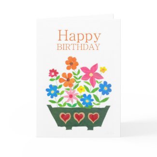
So I decided to experiment. I'd already had an idea for some kind of row of flowers in a 'window box' floating round in the back of my head for a couple of years but had never got around to doing anything about it.
I had lots of small but pretty pieces of handpainted paper left over from recent collages that were just right for flowers. So I decided that collage was the way to go. I began with the 'trough', trying to keep to nice, clean lines, nothing fussy - but couldn't help embellishing it with the hearts!

Birthday Flowers by helikettle
It's been standing on a shelf where I see it every time I sit down to a meal. So I've been thinking about it quite a lot, wondering how a style that looks almost like a child's drawing could have become so popular, in fact so 'chic'! I like it but it's not my style at all. Nothing about me is 'minimalist'; I'm more of a 'clutter and collections' person.
But after writing a blog post about 'copying' - Is Your Art Original? - a couple of weeks ago, I've been wondering whether I could deliberately adopt a different, more fashionable style, stopping short of meticulously copying someone else's work.
So I decided to experiment. I'd already had an idea for some kind of row of flowers in a 'window box' floating round in the back of my head for a couple of years but had never got around to doing anything about it.
I had lots of small but pretty pieces of handpainted paper left over from recent collages that were just right for flowers. So I decided that collage was the way to go. I began with the 'trough', trying to keep to nice, clean lines, nothing fussy - but couldn't help embellishing it with the hearts!

Birthday Flowers by helikettle
Next, I positioned the big, deep pink flower, followed by the three smaller blue ones, intending them to be supported on thin but dead straight stems as in the Mother's Day card design. The two orange flowers came next and that was all I had planned to do.
But I really didn't like the 'gaps' and began filling them in, working more instinctively and less 'thought-fully'. By the time I was happy with the flowers, there was no way that rigidly vertical stems would suit the design - and far more leaves crept in than I had planned for!
But I really didn't like the 'gaps' and began filling them in, working more instinctively and less 'thought-fully'. By the time I was happy with the flowers, there was no way that rigidly vertical stems would suit the design - and far more leaves crept in than I had planned for!
It seems, then, that even when I set out to change my style to something more 'modern', my own personality took over and produced something completely different. Yes, there are traces of 'influence' - the shapes of the flowers and leaves, for instance. But, unless I've missed something, I think the likeness ends there!
The objective of my little experiment was to try to pin down the extent to which I'm influenced by being constantly subjected to other artists' designs that I really like.
My conclusion is that yes, I am influenced but that my own 'style' probably always prevails. In this case, and almost certainly others before it, I ended up with something new, a slightly different style from my usual collages, even though it might still be recognisably 'me'. And I think that's a worthwhilestep to take to avoid becoming 'stale' - or copying oneself!
My conclusion is that yes, I am influenced but that my own 'style' probably always prevails. In this case, and almost certainly others before it, I ended up with something new, a slightly different style from my usual collages, even though it might still be recognisably 'me'. And I think that's a worthwhilestep to take to avoid becoming 'stale' - or copying oneself!
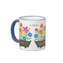
It isn't a question of which is the better design - people's tastes are so different! But I was quite pleased with my 'window-box' and I used it to create a mug, a tote bag, some stickers, an iPhone case and an apron on Zazzle, as well as greeting cards.
Someone else must have liked it too because the apron received a Today's Best Award and I've had some lovely comments on my store wall!
Someone else must have liked it too because the apron received a Today's Best Award and I've had some lovely comments on my store wall!
'Do not worry about your originality. You could not get rid of it even if you wanted to'. Robert Henri
It seems he's right!


12 comments:
Dear Judy,
Although the post is interesting, your current post and the another post do not discuss copyrights from a legal aspect. Is your "experiment" legally acceptable on internet in UK?
Each contry has a copyrights law that defines what original work, copy, originality, exeptions etc, etc. As an visual artist and a children pictuer book illustrator, I access the Australian one and member of CAL(Copyright Agency Ltd) and ASA(Australian Society of Authors). They always answer my legal Qs.
Have you ever checked UK laws?
If this comment is out of mark and offends you, so sorry. Just a thought and concern.
Kind regards, Sadami
Sadami and Judy,
I don't see any problem in the examples you put on this blog post. You've created a design which very much is yours.
I think that two things are important: every artist is influenced by another person's work. The important thing is to take the idea and create something special out of it - which you did.
As far as Germany is concerned acting against copyright law would have been if you'd taken the design of the first card, scanned it and created items with this digital file.
Dear Ulla,
I'm afraid you did not pick up my points: the copyrights issues and the legal definition of originality etc, not technical matters. Without understanding legal stuff, difficult to carry our business as a professional. Copyright laws could be tricky. Why? Depends on definitions and exceptions, copied products/art work are legally acceptable. But my case is Australian. I mentioned nothing on UK's law. Also, above, I raised the Qs on UK, not Germany. Thank you for reading.
Kind regards, Sadami
Hi Sadami - I'm sorry I've only just seen your comments as a big thunderstorm knocked out my internet connection all afternoon!
Thank you for your concern, and no, I'm not in the least bit offended!
I feel pretty sure that I haven't infinged any copyright laws because my intention was not to copy but to see whether I could produce something that would fit within a certain 'genre' of designs. The shops are full of similar designs, as are my greeting card magazines as they seem to be 'flavour of the moment'. I just gave the example above as an explanation of this style.
But my daughter is a solicitor and I'll ask her advice next time we speak.
Hi Ulla - thank you very much for your comment. I agree with everything you've said but I'll check with my solicitor daughter when we're next in touch.
I think the important point is that I specifically didn't set out to copy and even if I had, I didn't succeed!
Should be noted that ideas can not be copyrighted.
I think your new design is chic and modern and totally you.
We have the same thing in music where you can take ideas or parts of someone elses composition and integrate it into your own. The new composition is "original", but influenced by the other musician's work.
Di and Betsy - thank you very much for your reassuring comments.
I must admit it never occurred to me that experimenting for the sake of making a point about 'originality' and how easily we can be influenced to try new things, without necessarily realising it, could be infringing copyright!
great quote, so well suited. I find your window box very charming and yes it looks like your style. It's great! And Congratulations, well deserved.
Piccasso said 'all art is theft', meaning that we are all influenced by something. What you created is definately 'you'. Using current trends and fads is what designers make their living doing, there is a big difference between that and copying someone else's design.
I am starting to look at current trends far more than I did, I am convinced it helps to sell work. There are also long-term trends that always sell, animals for instance, fairies, beach huts... I could go on... I may write a book! As my daughter would say: lol
Hi Carole - thank you very much for your kind comments!
I think it's quite funny that everyone is recognising my style but I don't really recognise it myself!
Hi Michele - yes, I think I have that Picasso quote tucked away somewhere!
I've often read advice that we should go to trade fairs to see the current or upcoming trends. I used to go to Olympia and Earl's Court when I was doing Interior Design and jolly exhausting it was! But now we can just browse the internet to get the same info. Though it was the 'Progressive Greetings' (free trial copies!) magazine that started me thinking about this.
There's a list of the most popular greeting card subjects on the Phoenix Trading website. As far as I can remember,the top of the list was 'flowers' but I don't actually sell that many!
I'm amazed! That 'experimental' design has only been and gone and got another TBA! This time on a 'Thank You, Teacher' card - think I must experiment more often!!!
Post a Comment