
I've been happily switching from one to the other - and back again! - this week!
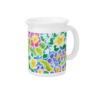
The primroses design from last week turned out to be very versatile and I used it to create about 60 products, which you can see here – and more to come later.
Here are just a couple to show how different the design looks when expanded to different sizes. I really enjoy the 'playing around' aspect to creating patterns and using them on different products!

But in between times, I’ve been doing something entirely different, abandoning my paintbrushes and paper for the ‘effects’ button in my photo-editing program! I've been having great fun playing with some of my previously handpainted or screenprinted designs to make new abstract patterns.
It felt a bit like ‘cheating’ but in fact it wasn’t particularly quick or easy; some designs worked better than others and they all took a fair amount of 'trial and error'.
The addictive nature of playing with images and not having to worry about making mistakes, or wasting expensive paper, meant that I actually spent much longer than I intended. But it wasn't time wasted - I won a Today’s Best Award on Zazzle for this iPhone case:

I haven’t abandoned my traditional tools of the trade, though, and I made a start on a Lilies-of-the-Valley May Birthday Card, part of my series of Birth Month Flower Birthday Cards. But it wasn't all plain sailing!
One of my favourite decorating styles is Art Nouveau and I also love painting flowers. And since the Art Nouveau style has its roots in plant and flower forms, you would think that I could easily paint my lilies in that style, inspired by my lovely book of Verneuil’s Art Nouveau Floral Designs. But strangely, I found it quite challenging. I found the very formal, heavily stylised approach to flowers decidedly stiff and unnatural to me. (And, if I'm honest, probably the need to draw and paint neatly went against the grain!) But I pressed on and this is where I've got to so far –

I still need to tidy up the leaves, add the caption and choose a background colour, for which I will use the paint bucket in my photo-editing program to ensure that it’s completely even, in case I can use this design as a repeating pattern as well as a greeting card. On my laptop, this background looks like beige, quite an authentic colour for Edwardian decorations. But I emailed it to a friend and she thought it was ‘mustard’ – one of the difficulties of viewing images online!
I hope to have made some progress by my next post . . . if I haven’t completely succumbed to the addiction of generating designs digitally!
.
5 comments:
Boy, you certainly are versatile! Nice work!
Thank you, Betsy :)
I would get dreadfully bored doing the same kind of thing all the time!
I love your primrose design it made such a perfect journal. I too have a hard time with anything like the lily of the valley design. My mother used to do Jacobean flowers in needlepoint and the design reminds me of it.
Hi Carole - glad you like my journal. And you're right, one of my sisters used to do something similar to your mother and that lily-of-the valley design was very much the kind of thing she did.
Really nice and versatile post...
Post a Comment