Showing posts with label poppy red. Show all posts

Thursday, 18 July 2013

Poppy Red - a Pantone Colour Choice for Spring/Summer 2013


Have you noticed Poppy Red in your local shops? It's one of the Pantone colour choices for Spring/Summer this year. 

But it didn't put in an appearance in Abergavenny until June. Maybe that's because, being the colour of fire, it's one of the 'hottest' colours, more associated with summer than spring. 

Or perhaps it was waiting for the poppies to bloom?

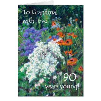
This oil pastel painting of a friend's garden is called, 'June Garden'. It's based on a photo I took when I had a birthday lunch with her - in June!


Whatever the reason for 'Poppy Red's' late arrival, there's a lot of it about now!

It's a colour I love - though, sadly, it doesn't suit me like it did when I was younger - so I looked it up in my big book of Colour. And here are a few of the interesting Facts about Red that I discovered.


  • Like yellow and orange, red is a colour that demands attention and is hard to miss. That's probably why the post boxes and the older telephone boxes in the UK are red -

- and of course, red traffic lights mean 'Stop!', a signal you won't want to miss!


  • Red is the colour at the top of the rainbow. Of interest to artists and photographers, is the fact that red appears to advance. Something red in the foreground of a painting or photo will give the image depth, especially if the background tends towards the blues, as in distant mountains.

  • Red is the first colour that babies perceive. Small children are attracted to it. The red crayons are always the most worn down in the box!

  • But in an environment with a lot of red, children become fractious - and maybe it's not just children! Red quickens the heart rate and stimulates the release of adrenalin. We use the phrase 'seeing red'; and 'red mist' is defined as, 'a feeling of extreme anger that clouds one's judgement temporarily'! 

  • But on a more positive note, red fruits and vegetables are not only attractive but good for us. You can read what it is that makes them a healthy choice HERE. Although there are plenty of green apples and others that are speckled with yellow and orange, traditionally, the red apples were thought to be the juiciest.

  • Red also stimulates the appetite - hence the heavily red-based decor of burger stalls and fast-food outlets.


And of course, Poppies seem to be one of the most popular flowers with artists. They can be quite a challenge to paint as their colour seems to change with the light and their petals are so fragile. 

Poppies come in a variety of colours but I always think of 'red' when I think of poppies. And this collection of patterns has been one of my most popular.

Here's a blog post I wrote about this beautiful flower a while back -


So how do you feel about Poppy Red? Is it a colour you're wearing this summer? For shoes maybe?  You'll certainly get noticed! 


But bearing in mind the effect of red on your heart rate and adrenalin, maybe stick to accents of Poppy Red in your home, rather than large, solid areas of this decidedly 'assertive' colour!


Wednesday, 29 May 2013

Is Small Town Fashion behind the times?

When you get to my time of life, you tend to wear clothes that suit you and hope that perhaps some up-to-the-minute accessories will prevent you looking utterly dowdy!

This is the sort of 'country style' I would expect from a small town in Wales with just a nod towards recent fashion with the Tangerine scarf and the Black and White dress. Not one of these colours is from the Pantone Spring/Summer 2013 forecast though.

I have absolutely no intention of dressing in Neon Yellow - or any other Neon colour, for that matter! And I'll gladly leave platform-soled shoes behind in the Seventies. 


Still plenty of stripes, polka dots and checks are everywhere. But the only sign of the chevrons that I've noticed abounding on shopping websites, was on some Kleenex boxes!

So noticing the latest trends in our local shops hadn't been a priority for quite some time. 


I found a lot of this very bright blue for both womens and menswear. (It was such a sunny day when I took these photos that reflections in the shop windows were a problem and made some of the blues look less bright than they really were.)

Once again the British Heart Foundation charity shop (check shirt, blue skirt and 'Poppies' floral dress) had clearly made more effort with their window-dressing than any of the other charity shops!

But then came the Surface Pattern course I took last winter. And it set me exercises that sent me off to the shops with my camera for precisely that purpose. 

Bright Pink with Turquoise seems to remain popular in spite of not being what Pantone forecasted!

And when I put on my 'designer's hat', it's useful for me know what people are looking for. 

Black and white was by far the most obvious 'trend' and I thought it was quite a novel idea to apply it to a nautical  pattern (the anchors) instead of the usual navy blue.

Abergavenny is a very small town. But it has plenty of upmarket, locally owned boutiques as well as small branches of some of the national chains. Quite a good cross-section of the clothing market, I think.


These I love! In fact I have a genuine 1930s aubergine-coloured lace dress in this style tucked away somewhere in my loft. I always intended to get  it repaired so that I could wear it but it's one of those things I never got around to.


The question is: Do I look to the online trend reports with their super-skinny models and fantastical clothes that often look as they've come straight from the costume hamper of a pantomime? Or do I look to the shops to see what people are actually buying? 

And, most importantly, is there a difference?


What do you think?


Wednesday, 22 May 2013

Surfacing Pattern Designers - Poppy Red and Vikings Showcase!


This month my fellow graduates of the Art & Business of Surface Pattern Design course have worked on 'Vikings' and/or 'Poppy Red' patterns.

Here they are in alphabetical order of first name:


Andrea Rincon
Anchobee Designs


Poppy Filigrane


Carol Robinson


Poppy Pots


Jan Shepherd


Poppies


Judy Adamson

Viking Shields Medley


Julie Ansbro

Paper Poppies


Liz Minton

Red Poppies


Mel Pope

Symbolic Speech


Natacha Devaud

Viking Dragon


Nicola Catherall Jones

Poppy Field


A big 
THANK YOU
 to all the artists who have contributed to this post!

As everyone is so busy at the moment, and I don't want to add to the pressure,
 I'm inviting anyone at all to send in a pattern
 that they have previously entered for a competition
but not been a winner.

I'm sure there are plenty of 'also ran's 
that deserve to see the light of day!

If you haven't entered any competitions and you'd still like to have your work 'showcased', this month's themes are 'Stitches' and/or 'Fiesta'.


Low Res images to me by Sunday, June 2, if possible,
but I'll do my best to accommodate any 'stragglers'

Thursday, 28 March 2013

Spring 2013 - What's Trending Where You Live?

One thing I learnt as a result of the Art and Business of Surface Pattern Design course is to keep my eyes open and my camera at the ready, even when I go shopping!

I live in Abergavenny, a small market town in South-east Wales, not far from the border with England. Abergavenny is known for its 'Markets, Mountains and More . . .' and if I walk into town on a Wednesday morning, I hear the sounds of sheep and cattle from the livestock market on my way. And from the park I cross on my way to the shops, I can see Sugarloaf, Skirrid and the Blorenge, the three mountains surrounding the town.

Not exactly the kind of place you would expect to find high fashion in the shops. But in fact, Abergavenny has far more shops than you might expect in a town of fewer than 15,000 inhabitants. And there's a good variety, ranging from quite a classy little department store and independent boutiques to small branches of most of the national chains.

I've been too busy to venture outside of Abergavenny for a while so I don't know how its shops compare with other places, but my impression is that most of the shopkeepers have at least some awareness of what is currently trending.

So here are some Trend Boards I've made from photos I took in town this week and you can decide whether or not Abergavenny's style is up-to-the-minute or lagging sadly behind!


My first impression was that there was 'Nautical' or 'Coastal' everywhere. There is certainly a lot of denim, canvas shoes, boater shoes, more denim, blue and white, even more denim - and 'deckchair' and 'matelot' stripes. But I also found some butterflies - on mens' clothing, unfortunately too small to show up here.

There are also a lot of 'Conversational Prints', which anyone who read Part One of Repeating Patterns for Painters, will know are patterns with everyday objects as motifs. Today I saw sailing boats, bicycles and paper aeroplanes on men's clothing! And I was pleased to find mini-prints that could have been Laura Ashley's in the Sixties and Seventies.


There is almost as much 'Tribal' - mostly in black and white and again, lots of stripes.


These were the shop windows that initially caught my eye. Not all of the green is Pantone's Tender Shoots Green and I think the yellow may be more influenced by Wales' national symbol, the daffodil, than by Pantone's Lemon Zest. But it all looks lovely and spring-like. There are bright green trousers for men and even the charity shop's window sported various shades of green, teamed with check shirts.


I finally spotted some Tangerine Tango in Abergavenny - better late than never! It was almost always teamed  with bright pink, one of my own favourite colour combinations.


Reds ranged from Pantone's Poppy Red in the department store window, through rusts and Burgundy to Aubergine. And there are still plenty of large florals, polka dots and lace.


Turquoise abounds in Abergavenny, often in combination with pink and white - checks, polkas, florals, and some with a definitely 'oriental' feel about them! If the green and yellow feel springlike and the orange and pink combination reminds us of roasting high temperature, this turquoise, pink and blue palette is somewhere in between.

In fact, I've got my eye on that check shirt - it's just the sort of thing that I'd be likely to wear a lot when the weather gets warmer. But after last year's wash-out of a summer, I feel it would be tempting fate to buy something so summery while it's still snowing outside!

So what's your verdict?

Are Abergavenny shops keeping up-to-date?

And what's on offer where you shop?

.