 The likelihood is that the drawing in my sketchbook isn't the correct size for a greeting card (usually 5" x 7", either portrait or landscape). So I scan it into my computer to adjust the size in Photoshop (or paint.net, which is very similar but free of charge!). If there is a lot of detail, I find it easier to work slightly larger so I often increase the size to 7.5" x 10.5", ie keeping the dimensions in proportion to the 'normal' size.
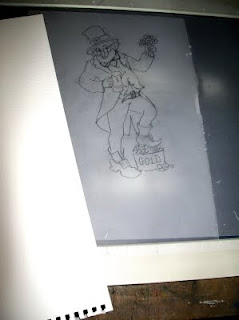
Then I print it out and make a tracing of it as I've found that tracing paper doesn't block out too much light from my lightbox - which, by the way, is actually my old, burnt-out A3 scanner that a neighbour kindly converted for me!
 The next step is to place the watercolour paper over the tracing on the lightbox, and to lightly draw the image in pencil. Usually, I would then draw the image in ink, away from the scanner, using the pencil outline for guidance but not following it strictly, which could take away the 'freshness' from the drawing.
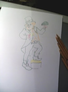
On this occasion, however, I decided to experiment and I carefully drew in the image with watercolour pencils. I wanted to see whether I could find a way to give the image quite a sharp definition but without the black ink-lines of a pen-and-wash drawing.
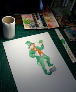
 Then I painted it with watercolours, slightly blending the coloured pencil lines into the washes. This is the table in my attic where I work and you can see that I use pans of watercolour paint, rather than tubes, as I rarely need to make a large amount of wash for such a small painting (10.5" x 7.5" at this stage). In fact one of the tins you can just about see in the photo has been with me since my school days. Some of the pans have been replaced many time, others not at all!
You may notice a strip of watercolour paper to the right of my work - that was a tip I picked up from watching Quentin Blake's wonderful video clip of how he works on his illustrations. The strip is 'officially' for trying out the washes before using them to check they are the right colour and strength - but I noticed that for small amounts, Quentin Black actually mixes right there on the paper and I find that works brilliantly when I just want a small amount of each colour - it saves on cleaning out palettes as well!
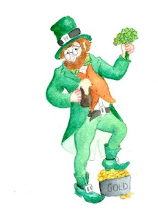
Finally, I put in some detail with the watercolour pencils and then I blended them with a fine-tipped, slightly moist paintbrush to tidy the whole thing up. Next, the image was scanned into the computer at 300 dpi to make sure that the whole card design that will be submitted is the correct size. (I've recently discovered the usefulness of the 'Canvas Size' button in Photoshop or paint.net for adjusting to the exact dimensions.)
 And here he is - a St Patrick's Day leprechaun!
All that's needed now is the caption, for which I will probably use Photoshop as my lettering isn't on of my strong points! Suggestions for the caption/greeting most welcome!

No comments:
Post a Comment